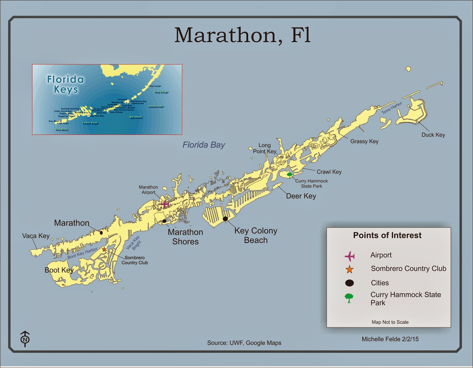
 This map is of the Marathon, Florida of the Florida Keys. The major cities were labeled, along with a state park and airport. Another key element to label was each key along with the bodies of waters. All of the edits to the map were created in CorelDraw. The main tools used were import, text tool, curve tool, and adjusting properties. I had to use lines to label the cities and keys since the labels were too large to place on the land.
 I had to think carefully of font size and position to make sure the map didn't become too crowded or hard to read. The different font sizes help the viewer determine which labels are the most important. I also kept the font san serif to help make it be more readable.
I think this lab was rather challenging to create a map that was easy to read and display all the elements. I feel if I was able to create a good map in this lab, I should be able to tackle most.
No comments:
Post a Comment