Showing posts with label Introduction to GIS. Show all posts

Thursday, April 30, 2015

GIS 4303: Final Project

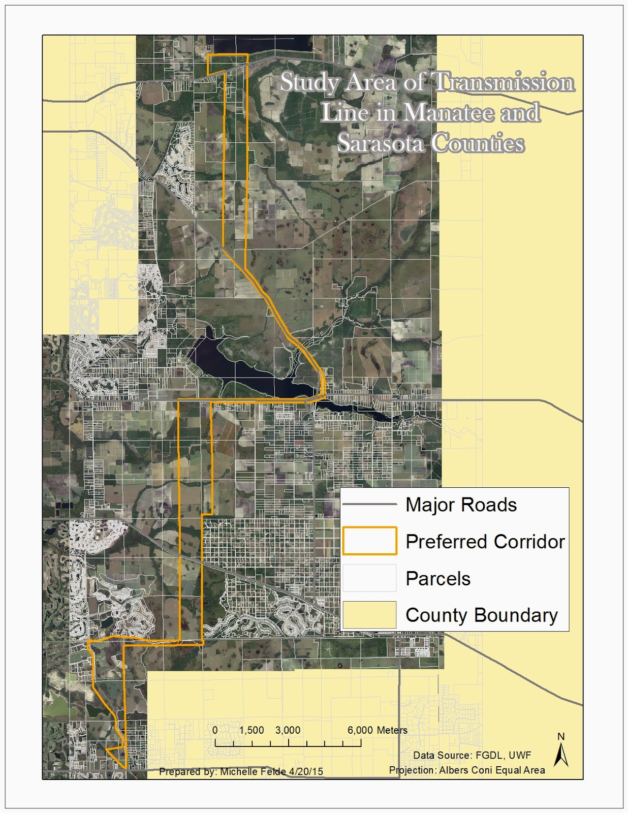
The final lab objective was to expose us to the experience of being a GIS professional.  The client was Florida Power & Light and they needed to install a new transmission line.  In order to meet FPL's objectives, it was important to apply all that was learned through the course.  It required gathering data, preforming buffers, select by attributes and more.

The main component of the lab consisted of seeing what land types, how many houses, how many schools, and cost that falls with in the preferred corridor for the transmission line.  To do this, it was necessary to clip land types to the corridor and calculate acres.  Creating a buffer around the preferred corridor also helped to see future impact on the community.  To count the numbers that fell within the corridor and buffer, heads up digitizing was a key part of the process. 

This lab was challenging, but in a great way.  I think it really helped me see what would be expected of me in the workplace for GIS analysts.  I think it also helped me show myself what I have really learned through this class.  Having to think of how to get a specific end result, really opens your eyes to various ways in ArcMap. 

To see my final maps and presentation click on the links below:


Saturday, April 11, 2015

GIS 4303: Week 13

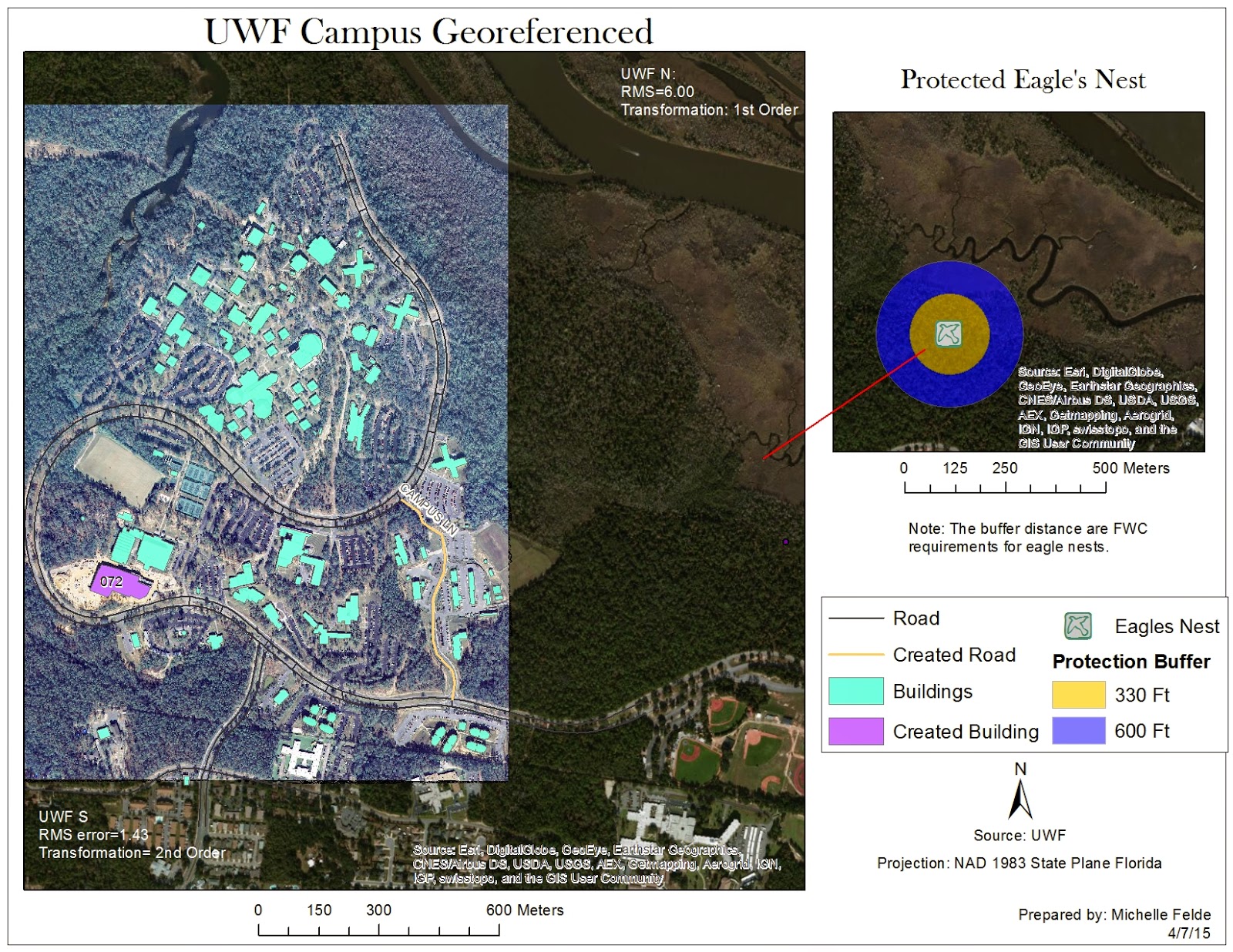
Week 13's lab introduced georeferencing which allows users to take a non-spatial referenced raster and have it line up with features.  By doing this, it gives the raster a spatial reference.  Also learned to create a multi ring buffer and the editor toolbar.  Another piece of the lab was learning to use ArcScene.  In ArcScene, user is able to create a 3D map and learn how to adjust the layers.

The first map I created using the georeferencing tool.  To do this, I had to pick points on the raster image and match the location on the vector polygon.  One key thing was keeping a low RMS error and making sure the placement looked accurate.  Some polygons and lines were missing, so I used the editor toolbar to create new features.  To show the protection shown of the eagle's next, had to create a multi ring buffer.

The second map I created, used the building layer in ArcScene.  In ArcScene, I was able to show the buildings in 3D.  There are quite a few things to adjust in ArcScene, like base height and vertical exaggeration.  This map shows the UWF campus buildings, in 3D with the roads called out.

Wednesday, April 1, 2015

GIS 4303: Week 12

This week's lab covered how to create an address locator, geocode addresses, and create a route analysis.  In addition to creating a route analysis, also found optimal route.

After downloading the census data, I opened the data in ArcCatalog to create the address locator.  I had to choose a reference field, selected dual range, and populate certain fields.  In ArcMap, added the feature class of addresses and selected Geocode Addresses.  I adjusted the minimum match requirement and geocoded the addresses.  I rematched the unmatched addresses by either picking address on the map or looking at the possible matches in the interactive box.

To find the best route of the Emergency Medical Service locations, I had to added stops to the map by using the Network Analyst toolbar.  I added three stops and used the Network Analysis to calculate the route.  Before that happened, I adjusted the analysis settings to find the best route in minutes, set up restrictions, and checked to avoid invalid locations.

The second part of the lab involving Model Builder.  This gave me good insight into how a model is crated and that is can be used to run multiple tools.  It seems like it would greatly save time and be used as notes to remember how a map was created.

Thursday, March 26, 2015

GIS 4303: Week 11

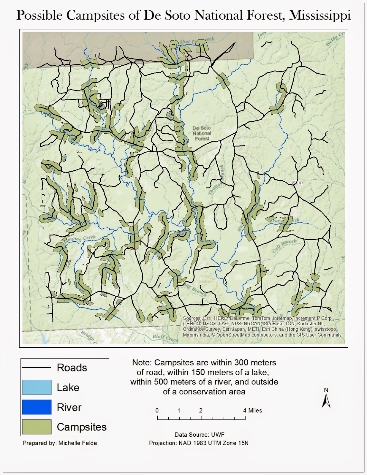
Week 11 lab assignment was the 2nd part of working with vector shapefiles.  Another key element of the lab was using various tools such as union and erase. Besides using different tools, also practiced different queries, attribute or location.

To create this map I used the buffer tool to create a bummer around the water and roads.  To perform the same buffer at different differences to save time, we used ArcPy.  This allowed me to run the buffer very quickly.

Once everything had a buffer applied, I moved into using overlay tools to find the possible campsites. One of the tools used was Union.  I joined the water and road buffers together to see where there is overlap.  To find the areas that aren't in conservation land, I used the erase tool to remove any overlap of roads/water buffer and conservation areas.  The final step was to take the new layer and use the Data Management tool of Multiple to Singlepart.  This allowed me to analyze the properties of specific locations.

Learning using ArcPy was my favorite part of the lab.  It seems like it can be very beneficial to use.

Thursday, March 5, 2015

GIS 4303: Week 7/8

Week 7/8 focused on retrieving data and displaying multiple layers.  Another key component to this lab was making sure all the data is in the same projection.

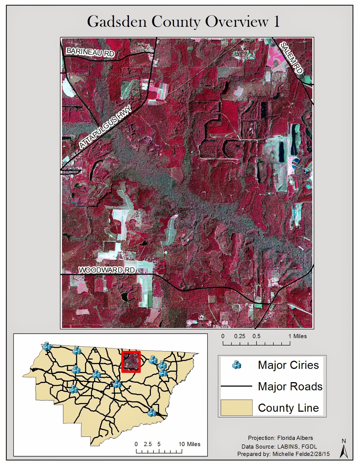
My maps cover Gadsden County.  This first map shows a digital orthophoto quarter quad of part of Gadsden County.  The inset map shows which part of the county it is and also helps show where the cities are in relation to the DOQQ.  I also labeled the roads to give a better understanding of the location.


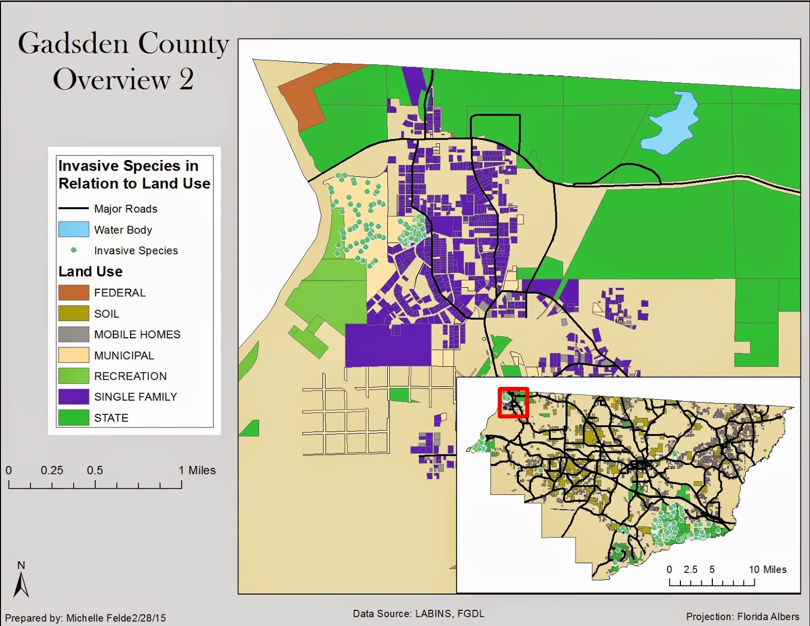
The second map shows the relationship between invasive species and land use.  I decided to show a small area of Gadsden County to show the relationship the best.  It is clear to see that the invasive species are around municipal land and parks.  I added the hydrology layer to see if that also affected the location of invasive species.  I added an inset map to help the viewer see where in Gadsden County I zoomed to.


The third map shows land cover and digital elevation model.  I also showed where the cities were in relation to both DEM and land cover.  It could be safe to guess that land cover and elevation might affect city locations.

Thursday, February 19, 2015

GIS 4303 Week 6

This week's lab was the second half of working with projections and adding X, Y data to our map.

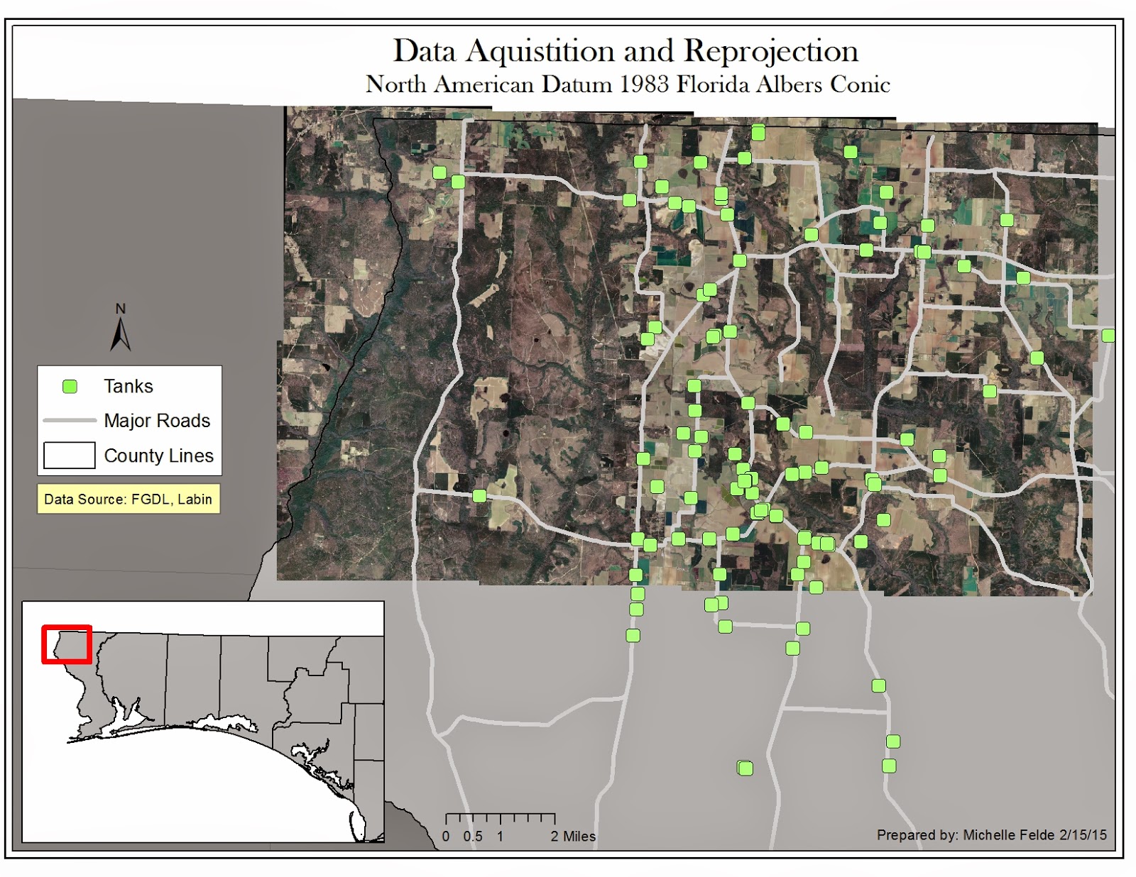
This map is of aerial photos of Escambia County of Florida.  The additional shapefiles of streets and counties need to have the projection changed to Florida Albers.  By doing this through the Project tool, the streets and aerial photos match up.

The next piece I have used at work and is very beneficial is adding points from X, Y data.  By adding this data and exporting it as a shapefile it places the storange tanks on to the map.  In order for the tanks to be in the right location, I had to reproject to WGS84.

I think this lab was good practice for what we will come across in the real world.  Data will be in different projections, but need to redefine it.  It shows how important it is to know details about your data so you can map accurately.

Sunday, February 8, 2015

GIS 4303 Week 5

Week 5 covered projection, how to reproject and how to adjust coordinate systems for different layers.  Also learned how to map multiple data frames.

This map is showing three different projections: UTM, Albers, and State Planar.  To create this map, three separate data frames were required.  I started with one shapefile of Florida and used the Project tool to change the projection into two other coordinate systems creating new layers.  Looking at the map of all three, it is clear to see how Florida changes under the projections.  The area of the four specific counties have changed from projection to projection.  The changes in area can also be seen in the legends.
This lab is one of the most important to understand.  Projection is key to creating an accurate map.  If the projection is off, locations won't be portrayed correctly.  Different data will be in various projections which is why it is important to learn how to change the coordinate system to a usable one.

Wednesday, February 4, 2015

GIS 4303 Week 4

Week 4 lab was about sharing maps on ArcGIS online and map packaging.  The first part of the lab was learning about map packaging and the different types of packaging.  I adjusted the data in ArcGIS and logged into ArcGIS online through ArcMap.  To have the map contents in my content, select Share As.  From this pop up box the item description, tags, credits, and summary.  I analyzed the share to make sure there were no errors and then selected Share. See Image 1 below.

The second part of the lab consisted of optimizing map package.  After adding the data, one layer would be a generalized layer while the other detailed.  In both layers I adjusted the symbology and set the scale from ArcGIS online to show the detailed trees if zoomed in at a large scale.  On the generalized layer, I adjusted the properties so the trees would be smaller when zoomed out, but invisible when zoomed at the large scale.  I then followed the steps from the previous section of selecting Share As and added the item description, tags, credits, and uploaded the text file for additional details.  See image 2 below.

Learning to share map packages seems for powerful and something to possibly use at my work.  It would allow for people to see the map created and work with it.  It also amazes me how much data you can share and use from others due to this tool. 


Image 1

Image 2

Tuesday, January 27, 2015

GIS 4303 Week 3

This week in Introduction to GIS we learned about adjusting symbology, difference between raster and vector data, and cartographic design.  The lab taught us how to design a map to display the message we want to communicate.

One of the maps created was to display the various roads, railroads, and rivers in Mexico with the urban areas.  The symbology was adjusted to show a clear and less cluttered map.  On this map, it was also more beneficial to label the cities of Mexico so the viewer could identify the urban area. Labeling the map also helps the viewer see which cities are in the center of Mexico.  Adding a new data layer to create an inset map was very helpful for the viewer to see the large map is the center of Mexico.

This lab really showed the importance of labels and symbology.  It was interesting to see how much a map changes and can be impacted by these properties.  Maps can easily show misguided information if you select poor choices in color or symbology.

I was happy to learn more tools to improve my maps while working on the last three processes of map design.

Tuesday, January 20, 2015

GIS 4043 Week 2 Lab

Module 2: Own Your Map

This module was about creating a professional looking map and using the tools of ArcMap to do it.

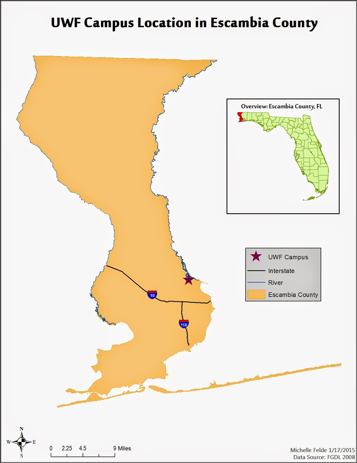
The map created this module contained an inset map.  The process to create an inset map taught me a lot of the capabilities of ArcMap and was excited to learn how to create it.  I wasn't aware of being able to have multiple data frames in one map. 

I really enjoyed walking through steps of editing layers and shapefiles to just show the information/data you only want the audience to see.  As I was going through the steps I was wondering how I might be able to apply these tricks to maps I have worked on in the past.

Once all the data was added to the table contents and map elements such as legend, title, north arrow, and scale, it was good exposure to play around with all the settings.  To re-size the data frames, legend, and north arrow.  It was interesting to see how adjusting items such as font can really change the look of a map as well.  I can also see how it is easy to get carried away and let all the tools/setting cause your map to lose focus of what is truly is about. 

Besides how a map looks being important, it is also important to know what data you are working with.  Seeing the metadata in ArcCatalog and how to see which coordinate system the data is in, seems to be one the key elements to creating a good map.

Sunday, January 11, 2015

GIS 4043 Week 1 Lab

This week in Introduction to GIS was the start to learning about ArcGIS desktop.  The lab taught the basic components of using ArcGIS and more specifically ArcMap. 

We first learned how to import shapefiles from our data.  The two shapefiles were the "Cities" and "World Countries".  The countries shapefile contained data on the population from 2007 which we could see from the attribute table.  The lab helped us locate certain countries by doing a Find.  Once we were done exploring all the tools, we created the map we wanted.

The first thing was adjusting the properties of each layer.  We changed the size and shape of the cities on the map.  We also changed the symbology of the World Countries shapefile. We selected to show the symbol by quantities.  The next step was to select what field that contained the attribute we wanted displayed, population.  Changing the color ramp helped define the population classes, which we adjusted to seven levels. 

The second part of the map was learning the key parts to a map.  The Insert menu contained the items we needed such as Title, Legend, Scale Bar, North Arrow, and Text box.  These elements helped explain the map.  Without these pieces the audience wouldn't know the population classes and what the map is telling.

Overall I felt this lab was very informative and helped me understand ArcMap even more.

The map I created is shown below.