The objectives of this lab was to understand the data needed to create a 3D map. With the data, learn to map 3D raster and vector data. Another objective was convert 2D features to 3D, along with using ArcScene and Analyst Extension. Adjusting base height and rendering was key in creating a well made map. Exporting the data as a .kmz allowed for us to interact with it in Google Earth.
3D mapping has pros and cons. A map in 3D is less boring and allows for more interaction. It can show an area in a different way than a map that is flat. A lot of different objects can be portrayed. 3D maps add an element of art and so many options to portray the map elements.
It is great for showing different landscapes and various options. 3D maps would be great for urban planning and presenting plans. The data can also be shared.
One con of 3D mapping is learning to use the tools. It also seems to take longer to process. 3D maps could be harder to interpret. In order to map 3D, need to have z values which might not always be available.
Friday, April 3, 2015

Wednesday, April 1, 2015
GIS 4303: Week 12
 This week's lab covered how to create an address locator, geocode addresses, and create a route analysis. In addition to creating a route analysis, also found optimal route.
 After downloading the census data, I opened the data in ArcCatalog to create the address locator. I had to choose a reference field, selected dual range, and populate certain fields. In ArcMap, added the feature class of addresses and selected Geocode Addresses. I adjusted the minimum match requirement and geocoded the addresses. I rematched the unmatched addresses by either picking address on the map or looking at the possible matches in the interactive box.
To find the best route of the Emergency Medical Service locations, I had to added stops to the map by using the Network Analyst toolbar. I added three stops and used the Network Analysis to calculate the route. Before that happened, I adjusted the analysis settings to find the best route in minutes, set up restrictions, and checked to avoid invalid locations.
The second part of the lab involving Model Builder. This gave me good insight into how a model is crated and that is can be used to run multiple tools. It seems like it would greatly save time and be used as notes to remember how a map was created.

Friday, March 27, 2015
Module 10: Dot Maps
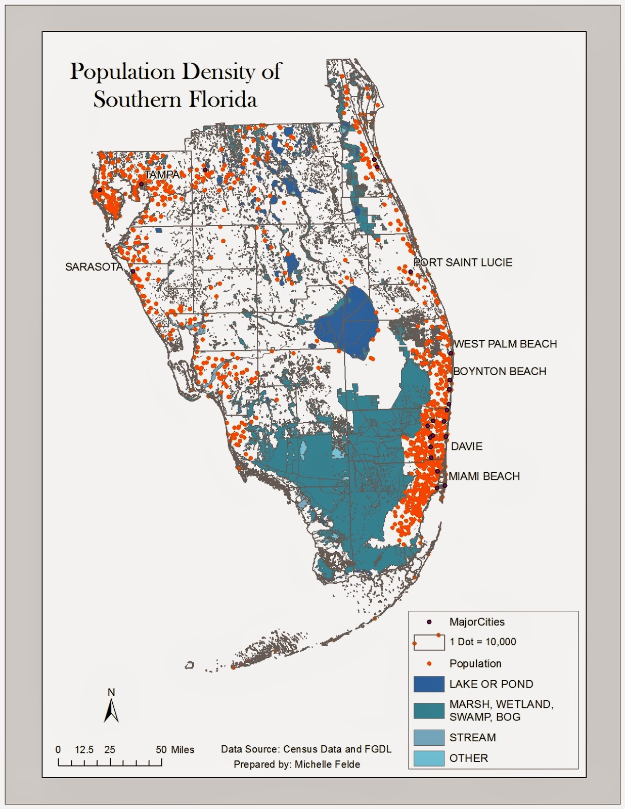 Module 10's objectives were to join spatial and tabular data, and understand dot density symbols. Along with dot density, a goal was to learn how to use masking and good dot map practices.
The map I prepared shows the population density of Florida counties. To create this map I joined census data to the county shapefile. Then I used the Quantities and Dot Density under the Symbology tab. I selected the Population field to use to display the dots and adjusted the dot size.
To avoid dots being placed where people do not live such as rivers or lakes, I used the masking property. Here I can select what layer the dots should be placed or which layer to avoid. I selected to have dots placed in urban areas.
Thursday, March 26, 2015
GIS 4303: Week 11
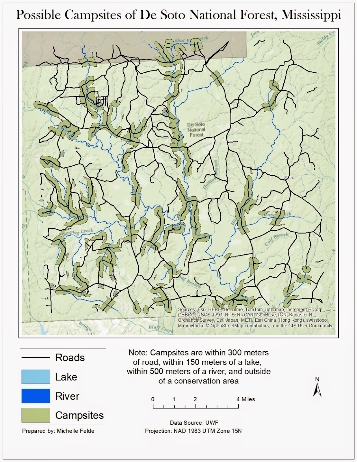 Week 11 lab assignment was the 2nd part of working with vector shapefiles. Another key element of the lab was using various tools such as union and erase. Besides using different tools, also practiced different queries, attribute or location.
To create this map I used the buffer tool to create a bummer around the water and roads. To perform the same buffer at different differences to save time, we used ArcPy. This allowed me to run the buffer very quickly.
Once everything had a buffer applied, I moved into using overlay tools to find the possible campsites. One of the tools used was Union. I joined the water and road buffers together to see where there is overlap. To find the areas that aren't in conservation land, I used the erase tool to remove any overlap of roads/water buffer and conservation areas. The final step was to take the new layer and use the Data Management tool of Multiple to Singlepart. This allowed me to analyze the properties of specific locations.
Learning using ArcPy was my favorite part of the lab. It seems like it can be very beneficial to use.
Friday, March 20, 2015
Module 9: Flow Lines
Week 9 lab covered flow maps. This lab covers creating a map with flow lines, calculating proportional line widths, and proper design for flow maps.
The map I prepared that shows migration between continents to the United States. The wider the line, the higher the migration rate to the United States in 2007. The map also shows which state had the highest percentage of immigrants.
To create this map, I used the migration statics to calculate line width. I chose to have maximum line width at 3.5. To calculate this I used the maximum line width multiplied by value divided by the maximum value. I added the flow lines by using the Bezier tool and adjusted the width accordingly. To add character to the flow lines, I used the bevel tool. This added another dimension and allowed me to change the shading of the flow line. I also adjusted the transparency to make it easier to see the small islands.
I think flow maps can very effectively display data. I look forward to when I can apply this to a map at my job.

The map I prepared that shows migration between continents to the United States. The wider the line, the higher the migration rate to the United States in 2007. The map also shows which state had the highest percentage of immigrants.
To create this map, I used the migration statics to calculate line width. I chose to have maximum line width at 3.5. To calculate this I used the maximum line width multiplied by value divided by the maximum value. I added the flow lines by using the Bezier tool and adjusted the width accordingly. To add character to the flow lines, I used the bevel tool. This added another dimension and allowed me to change the shading of the flow line. I also adjusted the transparency to make it easier to see the small islands.
I think flow maps can very effectively display data. I look forward to when I can apply this to a map at my job.
Thursday, March 5, 2015
Module 8: Isarithmic Mapping
For module 8, we worked with continuous raster data. With the data, it was also important to understand PRISM Interpolation Method. With Isarithmic mapping, learning how to display continuous data is important. We also learned another option for displaying the data through hyposemtric symbology and the legend that goes with it. Within the maps, to help the viewer, we learned about adding contour lines.
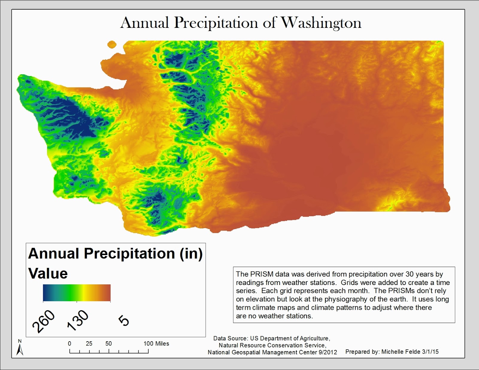
The first map I prepared showed the data with continuous symbology. This is done under the symbology tab of the layer's properties. The symbology stayed as "stretched". I added hillshade effect and adjusted the minimum and maximum. I added a legend with the graphic being horizontal and used the legend properties to expand the length of the graphic.
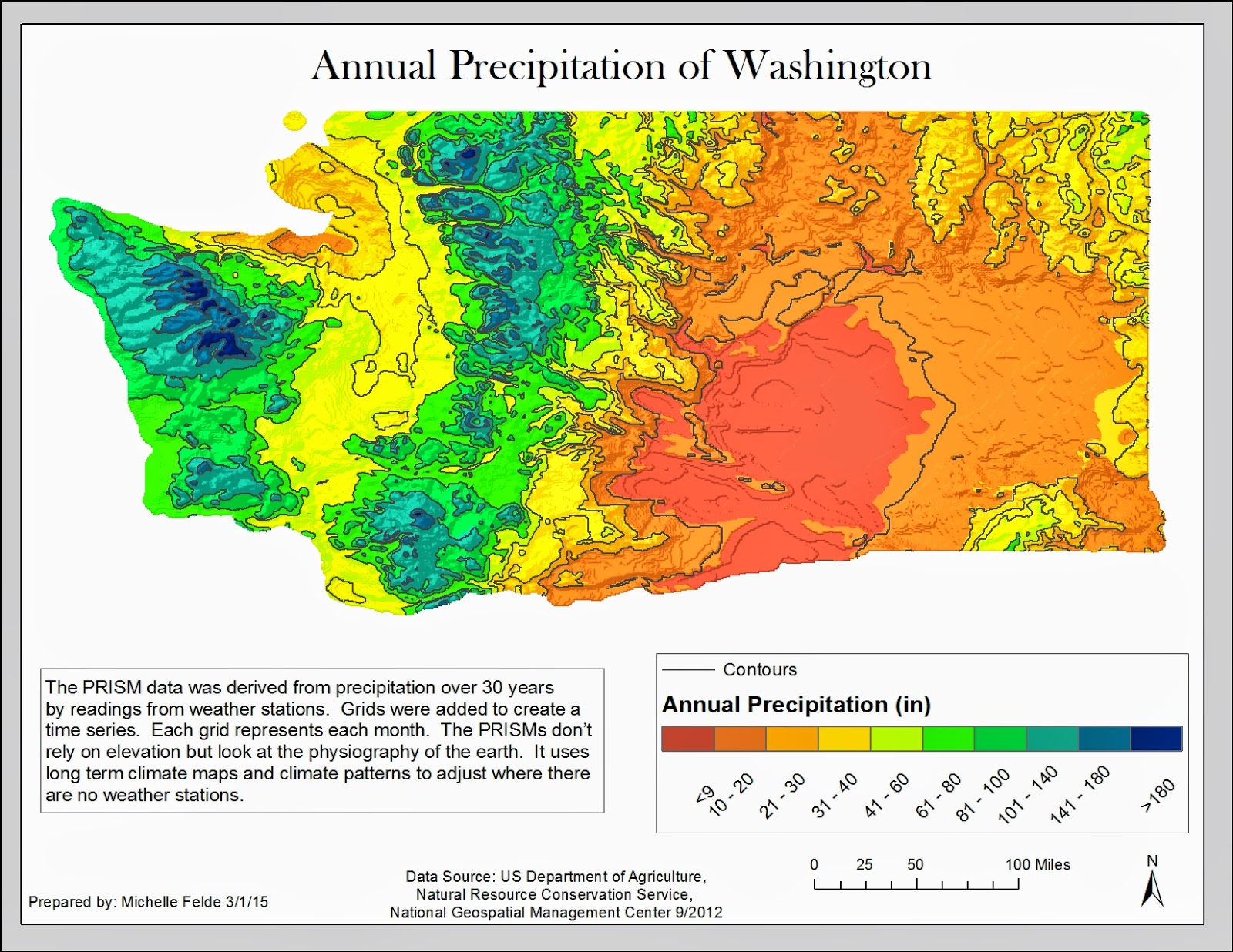
The second map I prepared shows the data with hyposemtric symbology. I first used the Int Spatial Analyst Tool to convert the raster values to integers for the contour lines. I followed the same steps as the first map but used classes to symbolize the data. I had the data broken up into 10 classes. Next added contour lines using the Contour List tool.
The maps show the annual precipitation of the state of Washington for 30 years. The contour lines help make the changes in precipitation easier to see and help with analysis.
The first map I prepared showed the data with continuous symbology. This is done under the symbology tab of the layer's properties. The symbology stayed as "stretched". I added hillshade effect and adjusted the minimum and maximum. I added a legend with the graphic being horizontal and used the legend properties to expand the length of the graphic.
The second map I prepared shows the data with hyposemtric symbology. I first used the Int Spatial Analyst Tool to convert the raster values to integers for the contour lines. I followed the same steps as the first map but used classes to symbolize the data. I had the data broken up into 10 classes. Next added contour lines using the Contour List tool.
The maps show the annual precipitation of the state of Washington for 30 years. The contour lines help make the changes in precipitation easier to see and help with analysis.
 |
| Map 1 |
 |
| Map 2 |
GIS 4303: Week 7/8
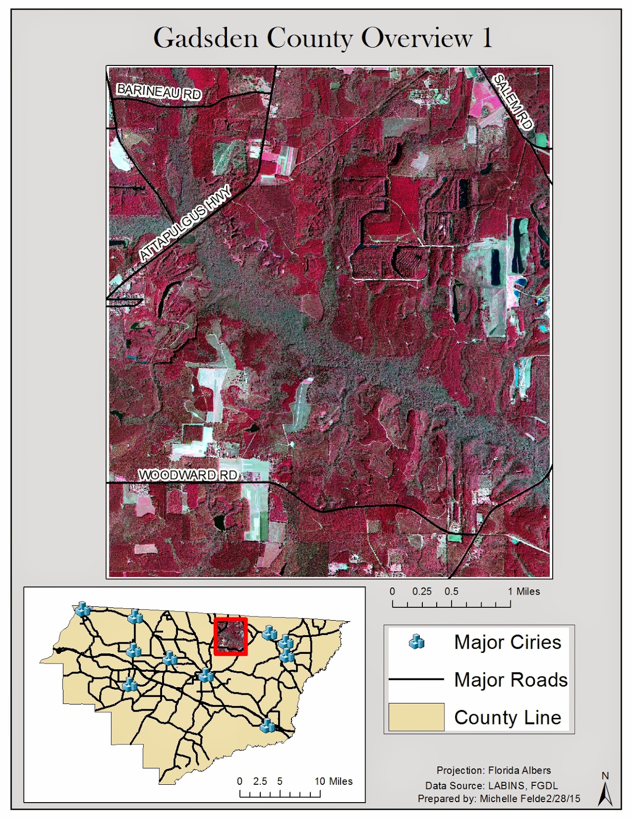 Week 7/8 focused on retrieving data and displaying multiple layers. Another key component to this lab was making sure all the data is in the same projection.
 My maps cover Gadsden County. This first map shows a digital orthophoto quarter quad of part of Gadsden County. The inset map shows which part of the county it is and also helps show where the cities are in relation to the DOQQ. I also labeled the roads to give a better understanding of the location.
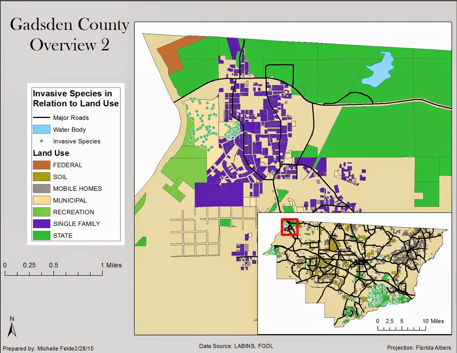
The second map shows the relationship between invasive species and land use. I decided to show a small area of Gadsden County to show the relationship the best. It is clear to see that the invasive species are around municipal land and parks. I added the hydrology layer to see if that also affected the location of invasive species. I added an inset map to help the viewer see where in Gadsden County I zoomed to.

The third map shows land cover and digital elevation model. I also showed where the cities were in relation to both DEM and land cover. It could be safe to guess that land cover and elevation might affect city locations.
Subscribe to:
Posts (Atom)