Tuesday, September 22, 2015

Module 4: Ground Truthing

Week four was another building week.  The objectives of this lab was to collect sample points, and check the accuracy of the classifications using Google Street View.

I decided to select 30 points at random.  I was concerned it would be difficult to be consistent with the systematic approach.  Randomly selecting points, I felt it would be very unbiased.  Once the points were selected, I selected one point and matched it up to Google Maps.  Once I located the point on Google, I zoomed in as much as possible.  Street view allowed me to see the front of the buildings if the point was on a building.  From seeing where the point actually fell, I could determine if my original classification was correct.

Most of my inaccuracy occurred when dots fell in the polygons that were classified as residential.  A lot of the dots ended up falling on trees or buildings that look like houses.  After using street view, it was clear they were commercial properties or industrial.  My accuracy rating was 67%.
Ground Truthing of LULC Classification

Monday, September 14, 2015

Lab 3: Land Use/Land Cover

This week's lab applied skills I learned from Lab 2, but now identifying features of land use and land cover.  The main objective was to find features and classify them using LULC classification,

Categorizing by land use and land cover
While identifying features in the aerial image, I wanted to look for patterns, association, and shapes to identify land use and land cover.  I started with the largest areas which were mainly residential features. This was easy to identify because of the small features, in a pattern.  I also was able to see the drive ways and yards.

The next thing was identify the different bodies of water.  This was easy to identify because of the color/shade and shapes of these features.  It was clear to see a long, narrow feature was a river.  It was also easy to identify the deciduous forest and shrubs by looking at texture and grouping with each other.

I struggled a little with identifying the different between commercial and industrial features.  Both require large square/rectangle buildings.  Parking lots can also be found at both.  However, commercial seemed to be along major road ways.  Industrial also seemed to have other smaller buildings besides the main building.  Industrial also seemed to have open land used for storage of possible trucks where as that is not necessary for commercial use.

I can see how digitizing aerial images can take months and a lot of patience.  I hope to improve my skills to make identifying features easier.

Monday, September 7, 2015

Remote Sensing Lab 2

Lab 2's objectives were to interpret textures and tones of aerial photographs.  Besides looking at textures and tones, also learn to identify land features and compare the features in true color and false infrared color.

The first map I created by looking at the aerial photograph to find very light to very dark tones.  Next, looked for very coarse to very fine textures.  The extremes of the tones and textures are easy to identify, but the tones and textures in between take more time to identify.


The second map I created to show different features in the aerial photograph.  Some features were easy to see because of the shape such as a road and vehicles.  It was interesting to see how much seeing a shadow really helps identify features like the trees and light poles.  Using patterns to identify features really helps identify features when originally they were hard to tell what they are.  Seeing a lot of smaller buildings along the roads helps tell me its a residential neighborhood.  The pier was easier to identify by looking at the surroundings.  


The last part of the lab was applying the skills of identifying land features and comparing those with different colors.  The first photo was in true color which made identifying the features easier.  Then the next photo was the same area but false infrared color.  It was interesting to see how objects that were green ended up being red in the false infrared colors.

Friday, May 1, 2015

Cartography Final

The final lab for the course was to create a map for the Washington Post that shows mean SAT scores and participation rates by state.  To create this map, there were some key things to keep in mind.  This lab required me to recall and use methods and techniques from the course.  Defining a projection and determining data classifications was another component.  This lab also required me to display two datasets onto one map.

To display the SAT mean scores and participation rates, I chose natural breaks classification.  It seemed to illustrate the data the best.  It made it easy to see which states had the lowest and highest scores.  It also made it easy to determine which states had high participation rates.  Making a map that allows the viewer to fully understand the data, is the main focus.  I felt the color scheme I chose made it easy to tell between averages.  It was also easy to see the light grey circles on the colors.

There was a lot of information that went into making of this map.  It required a good balance of where elements were placed as well as contrast.  I did not want the subtext to go unnoticed, so I added a white background.  I also wanted the legend to stand out to help the viewer, so adding white made it pop. This lab really required me to think of what goes into the best map design and I hope to use that train of thought on future maps.

Thursday, April 30, 2015

GIS 4303: Final Project

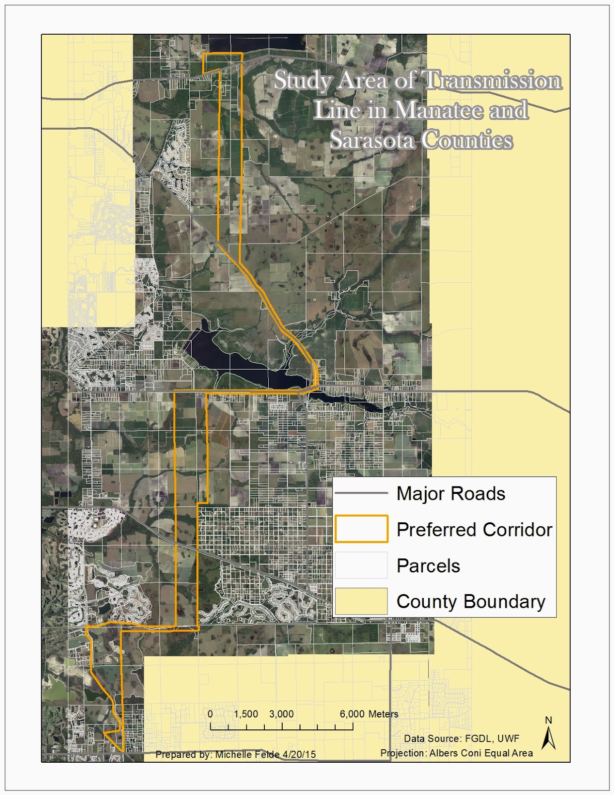
The final lab objective was to expose us to the experience of being a GIS professional.  The client was Florida Power & Light and they needed to install a new transmission line.  In order to meet FPL's objectives, it was important to apply all that was learned through the course.  It required gathering data, preforming buffers, select by attributes and more.

The main component of the lab consisted of seeing what land types, how many houses, how many schools, and cost that falls with in the preferred corridor for the transmission line.  To do this, it was necessary to clip land types to the corridor and calculate acres.  Creating a buffer around the preferred corridor also helped to see future impact on the community.  To count the numbers that fell within the corridor and buffer, heads up digitizing was a key part of the process. 

This lab was challenging, but in a great way.  I think it really helped me see what would be expected of me in the workplace for GIS analysts.  I think it also helped me show myself what I have really learned through this class.  Having to think of how to get a specific end result, really opens your eyes to various ways in ArcMap. 

To see my final maps and presentation click on the links below:


Saturday, April 11, 2015

GIS 4303: Week 13

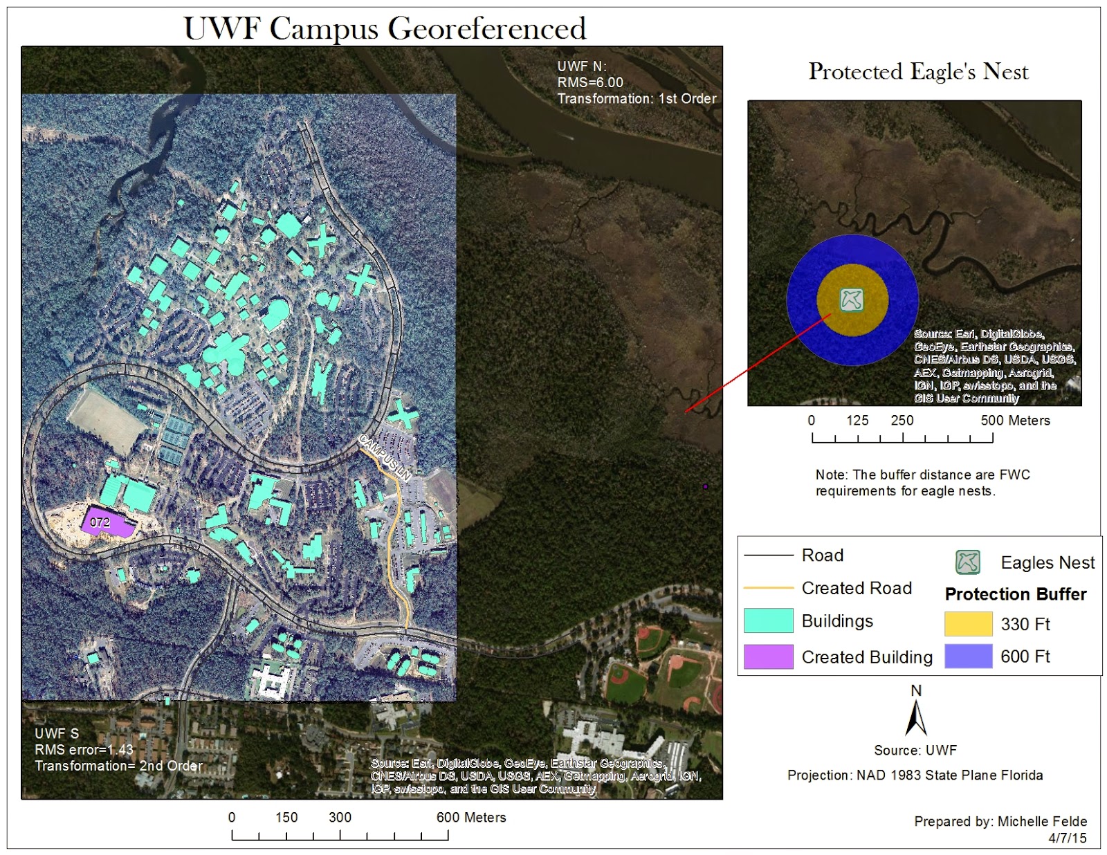
Week 13's lab introduced georeferencing which allows users to take a non-spatial referenced raster and have it line up with features.  By doing this, it gives the raster a spatial reference.  Also learned to create a multi ring buffer and the editor toolbar.  Another piece of the lab was learning to use ArcScene.  In ArcScene, user is able to create a 3D map and learn how to adjust the layers.

The first map I created using the georeferencing tool.  To do this, I had to pick points on the raster image and match the location on the vector polygon.  One key thing was keeping a low RMS error and making sure the placement looked accurate.  Some polygons and lines were missing, so I used the editor toolbar to create new features.  To show the protection shown of the eagle's next, had to create a multi ring buffer.

The second map I created, used the building layer in ArcScene.  In ArcScene, I was able to show the buildings in 3D.  There are quite a few things to adjust in ArcScene, like base height and vertical exaggeration.  This map shows the UWF campus buildings, in 3D with the roads called out.

Module 12: Google Earth Mapping

Module 12 of Cartography class showed a way to apply layers and maps from ArcMap to Google Earth.  By converting layers and maps into KML files, they open n Google Earth and the fun can really begin.  I have only used Google Earth a few times and now knowing how to create a tour, I can really see how powerful this could be to present data.

The screenshot below shows what adding a KML map to Google Earth looks like.  The screenshot shows the southern part of Florida.  You can see more of the state, but more data with the added map.  You can see where how population density is and then zoom into Google Earth.  I converted a layer file of the counties and a created map to KML to added it to Google Earth.  From there you can explore Florida and the various cities of interest.  It is a great way to interact with your data and the map itself.  Not only can you explore your area of interest, but expand and compare which would be more difficult in ArcMap.  Also, creating a tour allows the creator to show the viewer key places or data.

Sadly, don't see how I can use this at my current job.  As I work to complete my course, can't wait to search for a job that will let me apply all that I am learning.