Tuesday, November 10, 2015

Week 10: Supervised Classification

Week 10 objectives are to create spectral signatures and AOI features in ERDAS.  From there, create a newly classified image from a satellite image.  Once the image is recoded, identify and resolve confusion between the signatures.

Create the map below, I started with an image of Germantown, Maryland.  I opened the signature editor and added a new AOI layer.  I used the polygon tool to select features such as water and roads.  I used the inquire tool and coordinates to find urban areas, agriculture, and more.  If the feature seemed to contain a lot of differing pixels, I used the growing properties to select the feature I used the inquire tool for and adjusted the spectral Euclidean Distance. 

Once all my signatures were created, I looked at the different layers to see where confusion existed and to identify the best bands to display.  I used bands R-4, G-5, and B-6.  The final step was to recode all of the signatures.  I was able to calculate the areas of each class within ERDAS.  I was not 100% satisfied I was not able to eliminate all pixel confusion.  I attempted to adjust my signatures and change bands, but did not seem to find success.  I look forward to applying these techniques in through a potential job or practice to improve my skills.
Supervised Classification of Germantown, Maryland using bands R-4, G-5, and B-6

Tuesday, November 3, 2015

Module 9: Unsupervised Classification

Unsupervised Classification
The goal of the lab was to perform an unsupervised classification using ArcMap and ERDAS.  Another aspect of the lab was to classify images with different spatial and spectral resolution.  The final goal was to learn how to reclassify and recode images in ERDAS.

The lab started off with using the Iso Cluster tool and Maximum Likelihood Classification tool.  Doing this, it created a classified image which I assigned classes colors.

In ERDAS, I used the Unsupervised Classification tool.  This allowed for me to give the image 50 classes.  Once the image had the classes, I reclassified by opening the attribute tables to change the colors of the pixels that belong to each feature.  I did this throughout using the Swipe tool to help identify from the true image.  It was also helpful to change the pixel group to a red or yellow to see how much it is used in the image.  From there, I continued to classify the pixels.

Once the pixels were classified, I used the Merge tool to group the 5 classifications into 5 classes.  I looked at the classes and assigned them groups to bring the classes from 50 to 5. I added the area of the features to help determine how much is impermeable and permeable classes.

Tuesday, October 27, 2015

Lab 8: Thermal Infrared Images

The objectives of lab 8 is to interpret thermal infrared images using the Stefan Boltzmann constant and create thermal images by adjusting symbology and band combinations. The images that were used were from Ecuador and Pensacola.   

Once I went through the exercises, the last assignment was to identify features applying what I learned and enhance the image.  From the exercises in lab, I noticed there was a visible difference between farm land and natural vegetation when I adjusted the bands to R-6, G-4. B-7.  However, that difference was not as noticeable when I looked at the image with layer 6.  The two different feature types look very similar.  Band 6 shows how the vegetation emits less energy than the urban areas.
Thermal and Multispectral Image of Ecuador

Tuesday, October 20, 2015

Lab 7: Multispectral Image

The objectives of lab 7 were to look at the histograms of an image and use tools to look at data.  By looking at the histogram, an objective was to interpret the data. Within ERDAS, also use the Inquire Cursor tool to look at pixel data and find tools from the Help Tab.  After going through all the exercises, applied skills to identify features.

By looking at the metadata histograms, I was able to see if the features I was looking for were dark or light.  The size of the spike also told me if the feature was large or small.  Once I had an idea of the brightness and size, I used the inquire cursor to see pixel count.  I was then able to see the pixel count for each layer and see if it matched the clues.  I then adjusted the color to spectrum to help highlight the features I needed to find.
Deep Water - TM False Natural Color

Snow - True Color

Shallow Water - Near Infrared Color

Tuesday, October 13, 2015

Lab 6: Image Enhancement

Enhanced Image
This week's lab objectives were to download satellite images from USGS.  Once the data was downloaded, perform spatial enhancement in ArcMap and ERDAS.  The enhancements included high and low pass filters and Fourier Analysis.

To enhance the striped image, I used the Fourier Analysis tool to fill in the striped areas.  By using the Wedge tool and Low Pass button.  Once this was done, I sharpened the image with kernel size 3x3.  After sharpening the image, I used the convolution tool to apply a 3x3 low pass filter.  Once that filter was applied, I moved the image to ArcMap where I adjusted the histogram.

I enjoyed this lab because it was interesting to see how images can be improved and by various tools.  However, it was challenging to figure out how to continue to improve the image.  I did play around with various filters and tools.  It is clear a lot of experience and practice is needed to develop image enhancement skills.

Tuesday, September 29, 2015

Remote Sensing: ERDAS Imagine

Lab 5a objectives were to calculate wavelength, energy of EMR, and frequency.  The other part of the lab was to learn how to use ERDAS Imagine and view the data with the Viewer.  The final part of the lab was to take subset data and prepare a map.

The first part of the lab compared the relationship between wavelength and frequency.  The calculation compared wavelength to energy.

Once in ERDAS Image, I played around with various tools such as zoom and pan.  It was also important to go through the different options for the raster after adding it to the table of contents.  After adjusting options. added a Viewer #2.  After having the image of Washington, I adjusted the color bands to show the forest land.

Another tool I learned was adding a column to an attribute table.  This helped show the power of ERDAS Image and exporting to ArcMap.  Using the Inquire Box tool from the Home tab allowed me to select an area of the Washington State image and then subset created the smaller image.  Exporting this into ArcMap allowed me to change the symbology to show the different classes and then prepare a map.


ERDAS Image and Classification

Tuesday, September 22, 2015

Module 4: Ground Truthing

Week four was another building week.  The objectives of this lab was to collect sample points, and check the accuracy of the classifications using Google Street View.

I decided to select 30 points at random.  I was concerned it would be difficult to be consistent with the systematic approach.  Randomly selecting points, I felt it would be very unbiased.  Once the points were selected, I selected one point and matched it up to Google Maps.  Once I located the point on Google, I zoomed in as much as possible.  Street view allowed me to see the front of the buildings if the point was on a building.  From seeing where the point actually fell, I could determine if my original classification was correct.

Most of my inaccuracy occurred when dots fell in the polygons that were classified as residential.  A lot of the dots ended up falling on trees or buildings that look like houses.  After using street view, it was clear they were commercial properties or industrial.  My accuracy rating was 67%.
Ground Truthing of LULC Classification

Monday, September 14, 2015

Lab 3: Land Use/Land Cover

This week's lab applied skills I learned from Lab 2, but now identifying features of land use and land cover.  The main objective was to find features and classify them using LULC classification,

Categorizing by land use and land cover
While identifying features in the aerial image, I wanted to look for patterns, association, and shapes to identify land use and land cover.  I started with the largest areas which were mainly residential features. This was easy to identify because of the small features, in a pattern.  I also was able to see the drive ways and yards.

The next thing was identify the different bodies of water.  This was easy to identify because of the color/shade and shapes of these features.  It was clear to see a long, narrow feature was a river.  It was also easy to identify the deciduous forest and shrubs by looking at texture and grouping with each other.

I struggled a little with identifying the different between commercial and industrial features.  Both require large square/rectangle buildings.  Parking lots can also be found at both.  However, commercial seemed to be along major road ways.  Industrial also seemed to have other smaller buildings besides the main building.  Industrial also seemed to have open land used for storage of possible trucks where as that is not necessary for commercial use.

I can see how digitizing aerial images can take months and a lot of patience.  I hope to improve my skills to make identifying features easier.

Monday, September 7, 2015

Remote Sensing Lab 2

Lab 2's objectives were to interpret textures and tones of aerial photographs.  Besides looking at textures and tones, also learn to identify land features and compare the features in true color and false infrared color.

The first map I created by looking at the aerial photograph to find very light to very dark tones.  Next, looked for very coarse to very fine textures.  The extremes of the tones and textures are easy to identify, but the tones and textures in between take more time to identify.


The second map I created to show different features in the aerial photograph.  Some features were easy to see because of the shape such as a road and vehicles.  It was interesting to see how much seeing a shadow really helps identify features like the trees and light poles.  Using patterns to identify features really helps identify features when originally they were hard to tell what they are.  Seeing a lot of smaller buildings along the roads helps tell me its a residential neighborhood.  The pier was easier to identify by looking at the surroundings.  


The last part of the lab was applying the skills of identifying land features and comparing those with different colors.  The first photo was in true color which made identifying the features easier.  Then the next photo was the same area but false infrared color.  It was interesting to see how objects that were green ended up being red in the false infrared colors.

Friday, May 1, 2015

Cartography Final

The final lab for the course was to create a map for the Washington Post that shows mean SAT scores and participation rates by state.  To create this map, there were some key things to keep in mind.  This lab required me to recall and use methods and techniques from the course.  Defining a projection and determining data classifications was another component.  This lab also required me to display two datasets onto one map.

To display the SAT mean scores and participation rates, I chose natural breaks classification.  It seemed to illustrate the data the best.  It made it easy to see which states had the lowest and highest scores.  It also made it easy to determine which states had high participation rates.  Making a map that allows the viewer to fully understand the data, is the main focus.  I felt the color scheme I chose made it easy to tell between averages.  It was also easy to see the light grey circles on the colors.

There was a lot of information that went into making of this map.  It required a good balance of where elements were placed as well as contrast.  I did not want the subtext to go unnoticed, so I added a white background.  I also wanted the legend to stand out to help the viewer, so adding white made it pop. This lab really required me to think of what goes into the best map design and I hope to use that train of thought on future maps.

Thursday, April 30, 2015

GIS 4303: Final Project

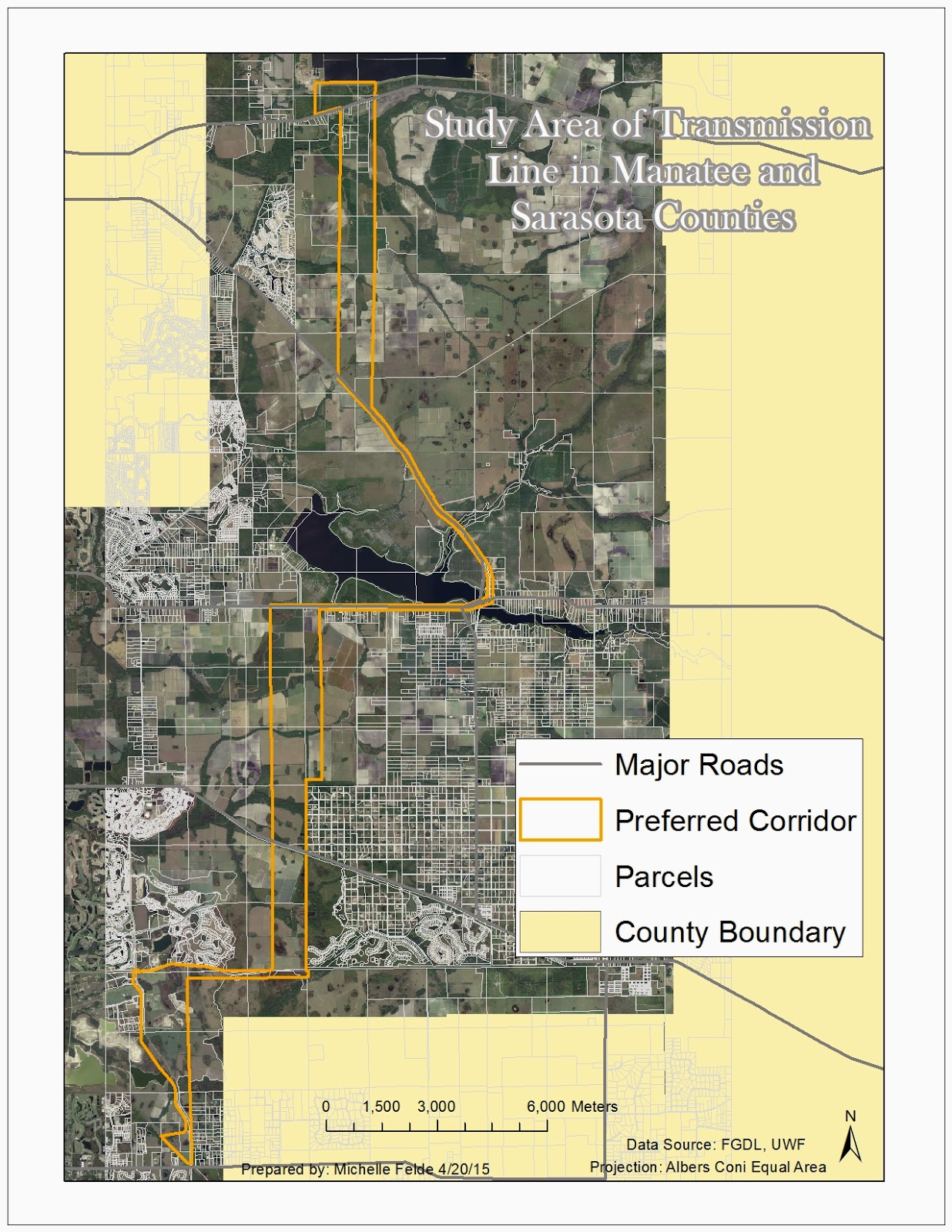
The final lab objective was to expose us to the experience of being a GIS professional.  The client was Florida Power & Light and they needed to install a new transmission line.  In order to meet FPL's objectives, it was important to apply all that was learned through the course.  It required gathering data, preforming buffers, select by attributes and more.

The main component of the lab consisted of seeing what land types, how many houses, how many schools, and cost that falls with in the preferred corridor for the transmission line.  To do this, it was necessary to clip land types to the corridor and calculate acres.  Creating a buffer around the preferred corridor also helped to see future impact on the community.  To count the numbers that fell within the corridor and buffer, heads up digitizing was a key part of the process. 

This lab was challenging, but in a great way.  I think it really helped me see what would be expected of me in the workplace for GIS analysts.  I think it also helped me show myself what I have really learned through this class.  Having to think of how to get a specific end result, really opens your eyes to various ways in ArcMap. 

To see my final maps and presentation click on the links below:


Saturday, April 11, 2015

GIS 4303: Week 13

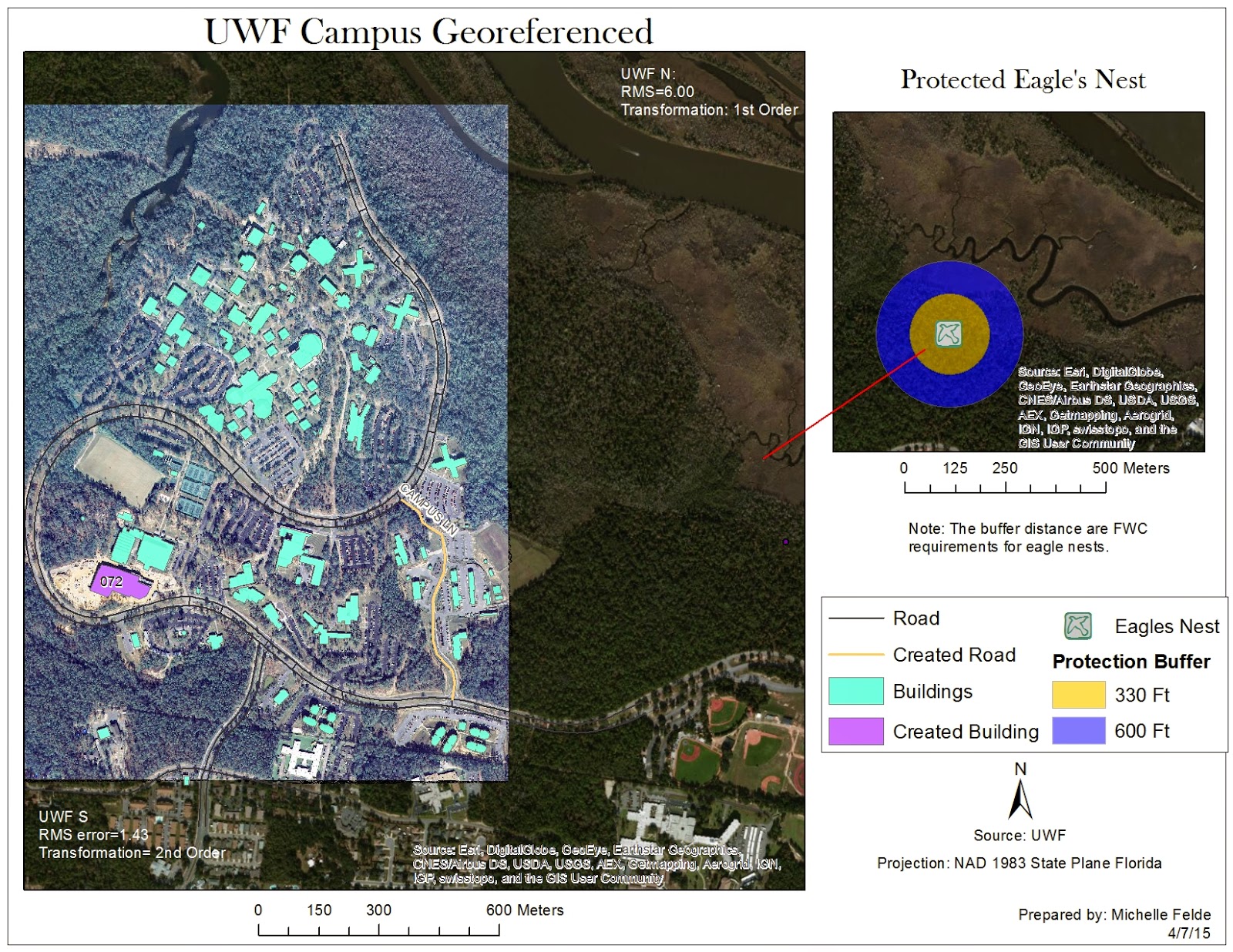
Week 13's lab introduced georeferencing which allows users to take a non-spatial referenced raster and have it line up with features.  By doing this, it gives the raster a spatial reference.  Also learned to create a multi ring buffer and the editor toolbar.  Another piece of the lab was learning to use ArcScene.  In ArcScene, user is able to create a 3D map and learn how to adjust the layers.

The first map I created using the georeferencing tool.  To do this, I had to pick points on the raster image and match the location on the vector polygon.  One key thing was keeping a low RMS error and making sure the placement looked accurate.  Some polygons and lines were missing, so I used the editor toolbar to create new features.  To show the protection shown of the eagle's next, had to create a multi ring buffer.

The second map I created, used the building layer in ArcScene.  In ArcScene, I was able to show the buildings in 3D.  There are quite a few things to adjust in ArcScene, like base height and vertical exaggeration.  This map shows the UWF campus buildings, in 3D with the roads called out.

Module 12: Google Earth Mapping

Module 12 of Cartography class showed a way to apply layers and maps from ArcMap to Google Earth.  By converting layers and maps into KML files, they open n Google Earth and the fun can really begin.  I have only used Google Earth a few times and now knowing how to create a tour, I can really see how powerful this could be to present data.

The screenshot below shows what adding a KML map to Google Earth looks like.  The screenshot shows the southern part of Florida.  You can see more of the state, but more data with the added map.  You can see where how population density is and then zoom into Google Earth.  I converted a layer file of the counties and a created map to KML to added it to Google Earth.  From there you can explore Florida and the various cities of interest.  It is a great way to interact with your data and the map itself.  Not only can you explore your area of interest, but expand and compare which would be more difficult in ArcMap.  Also, creating a tour allows the creator to show the viewer key places or data.

Sadly, don't see how I can use this at my current job.  As I work to complete my course, can't wait to search for a job that will let me apply all that I am learning.


Friday, April 3, 2015

Module 11: 3D Mapping

The objectives of this lab was to understand the data needed to create a 3D map.  With the data, learn to map 3D raster and vector data.  Another objective was convert 2D features to 3D, along with using ArcScene and Analyst Extension.  Adjusting base height and rendering was key in creating a well made map.  Exporting the data as a .kmz allowed for us to interact with it in Google Earth.

3D mapping has pros and cons.  A map in 3D is less boring and allows for more interaction.  It can show an area in a different way than a map that is flat.  A lot of different objects can be portrayed.  3D maps add an element of art and so many options to portray the map elements.

It is great for showing different landscapes and various options.  3D maps would be great for urban planning and presenting plans.  The data can also be shared.

One con of 3D mapping is learning to use the tools.  It also seems to take longer to process.  3D maps could be harder to interpret.  In order to map 3D, need to have z values which might not always be available.

Wednesday, April 1, 2015

GIS 4303: Week 12

This week's lab covered how to create an address locator, geocode addresses, and create a route analysis.  In addition to creating a route analysis, also found optimal route.

After downloading the census data, I opened the data in ArcCatalog to create the address locator.  I had to choose a reference field, selected dual range, and populate certain fields.  In ArcMap, added the feature class of addresses and selected Geocode Addresses.  I adjusted the minimum match requirement and geocoded the addresses.  I rematched the unmatched addresses by either picking address on the map or looking at the possible matches in the interactive box.

To find the best route of the Emergency Medical Service locations, I had to added stops to the map by using the Network Analyst toolbar.  I added three stops and used the Network Analysis to calculate the route.  Before that happened, I adjusted the analysis settings to find the best route in minutes, set up restrictions, and checked to avoid invalid locations.

The second part of the lab involving Model Builder.  This gave me good insight into how a model is crated and that is can be used to run multiple tools.  It seems like it would greatly save time and be used as notes to remember how a map was created.

Friday, March 27, 2015

Module 10: Dot Maps

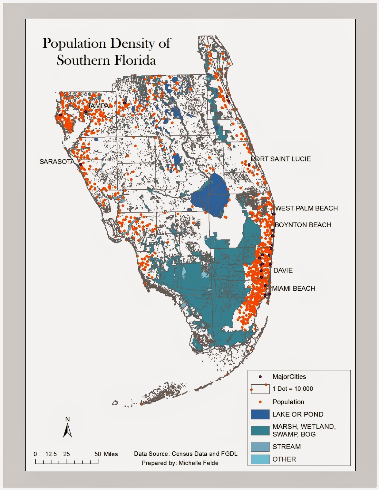
Module 10's objectives were to join spatial and tabular data, and understand dot density symbols.  Along with dot density, a goal was to learn how to use masking and good dot map practices.

The map I prepared shows the population density of Florida counties.  To create this map I joined census data to the county shapefile.  Then I used the Quantities and Dot Density under the Symbology tab.  I selected the Population field to use to display the dots and adjusted the dot size.

To avoid dots being placed where people do not live such as rivers or lakes, I used the masking property.  Here I can select what layer the dots should be placed or which layer to avoid.  I selected to have dots placed in urban areas.


Thursday, March 26, 2015

GIS 4303: Week 11

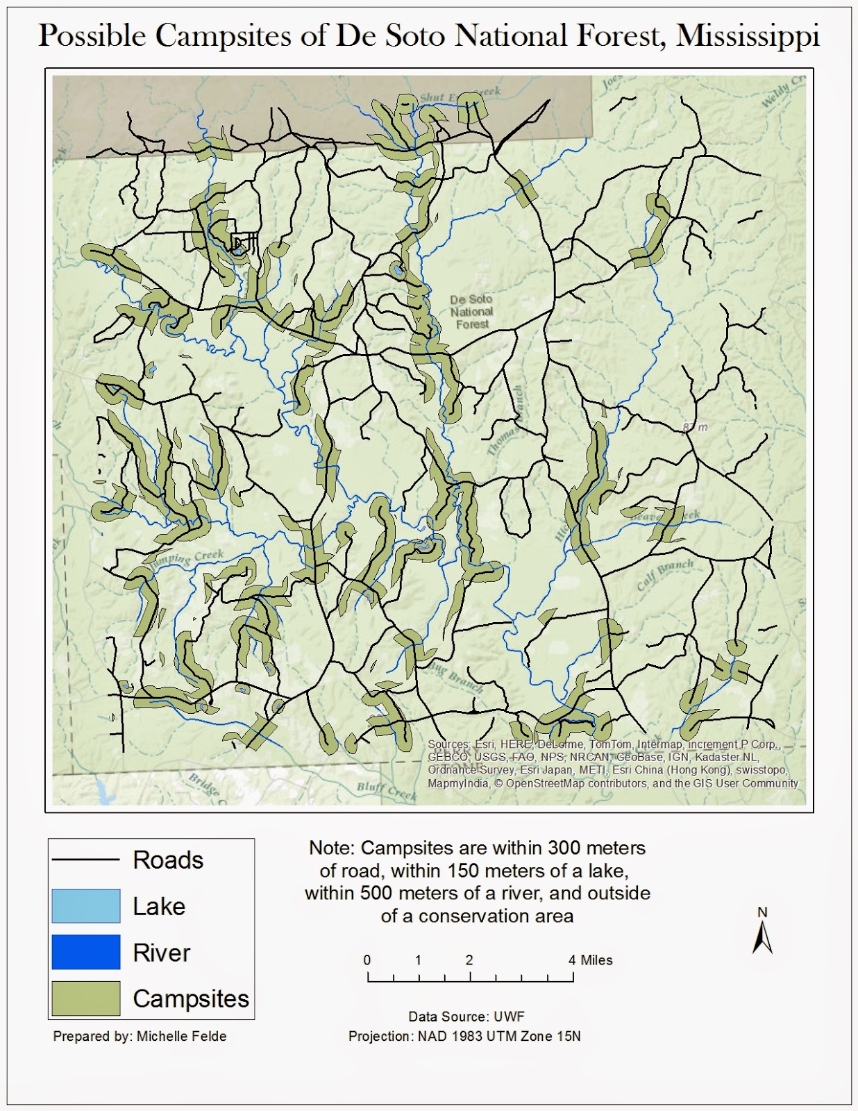
Week 11 lab assignment was the 2nd part of working with vector shapefiles.  Another key element of the lab was using various tools such as union and erase. Besides using different tools, also practiced different queries, attribute or location.

To create this map I used the buffer tool to create a bummer around the water and roads.  To perform the same buffer at different differences to save time, we used ArcPy.  This allowed me to run the buffer very quickly.

Once everything had a buffer applied, I moved into using overlay tools to find the possible campsites. One of the tools used was Union.  I joined the water and road buffers together to see where there is overlap.  To find the areas that aren't in conservation land, I used the erase tool to remove any overlap of roads/water buffer and conservation areas.  The final step was to take the new layer and use the Data Management tool of Multiple to Singlepart.  This allowed me to analyze the properties of specific locations.

Learning using ArcPy was my favorite part of the lab.  It seems like it can be very beneficial to use.

Friday, March 20, 2015

Module 9: Flow Lines

Week 9 lab covered flow maps.  This lab covers creating a map with flow lines, calculating proportional line widths, and proper design for flow maps.

The map I prepared that shows migration between continents to the United States.  The wider the line, the higher the migration rate to the United States in 2007.  The map also shows which state had the highest percentage of immigrants.

To create this map, I used the migration statics to calculate line width.  I chose to have maximum line width at 3.5.  To calculate this I used the maximum line width multiplied by value divided by the maximum value.  I added the flow lines by using the Bezier tool and adjusted the width accordingly.  To add character to the flow lines, I used the bevel tool.  This added another dimension and allowed me to change the shading of the flow line.  I also adjusted the transparency to make it easier to see the small islands.

I think flow maps can very effectively display data.  I look forward to when I can apply this to a map at my job.

Thursday, March 5, 2015

Module 8: Isarithmic Mapping

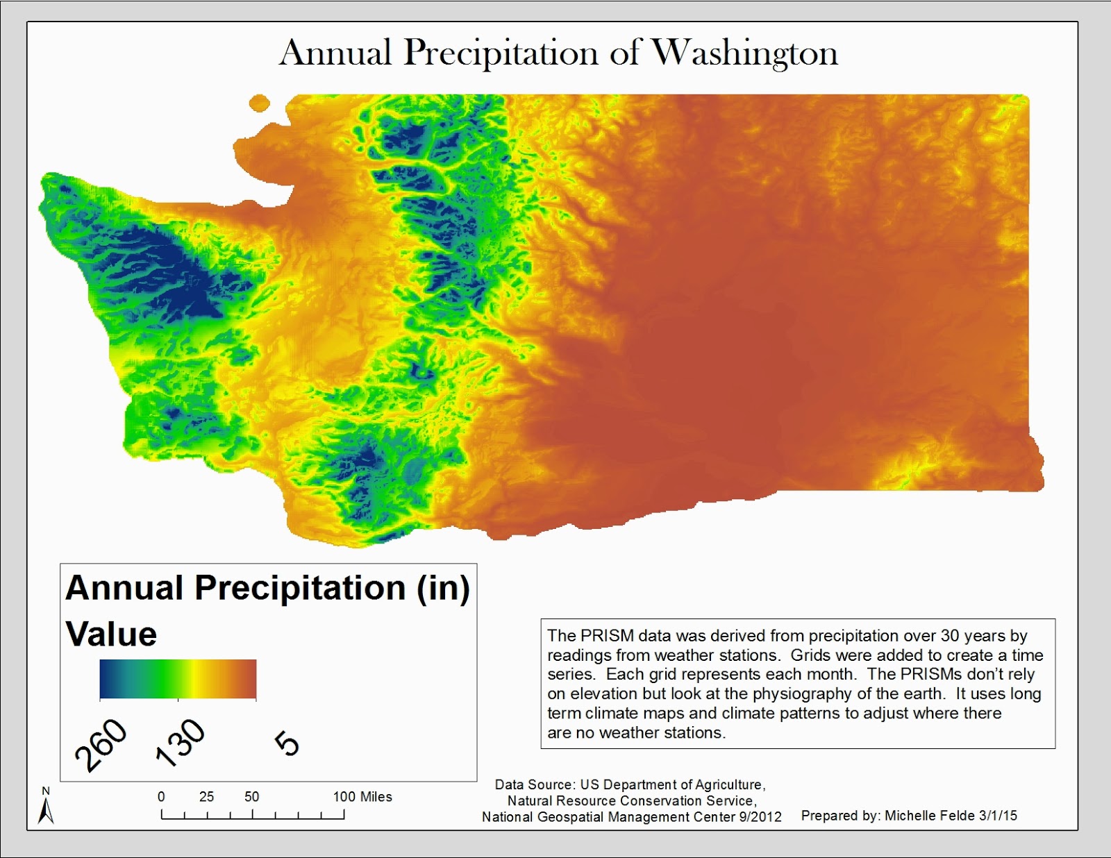
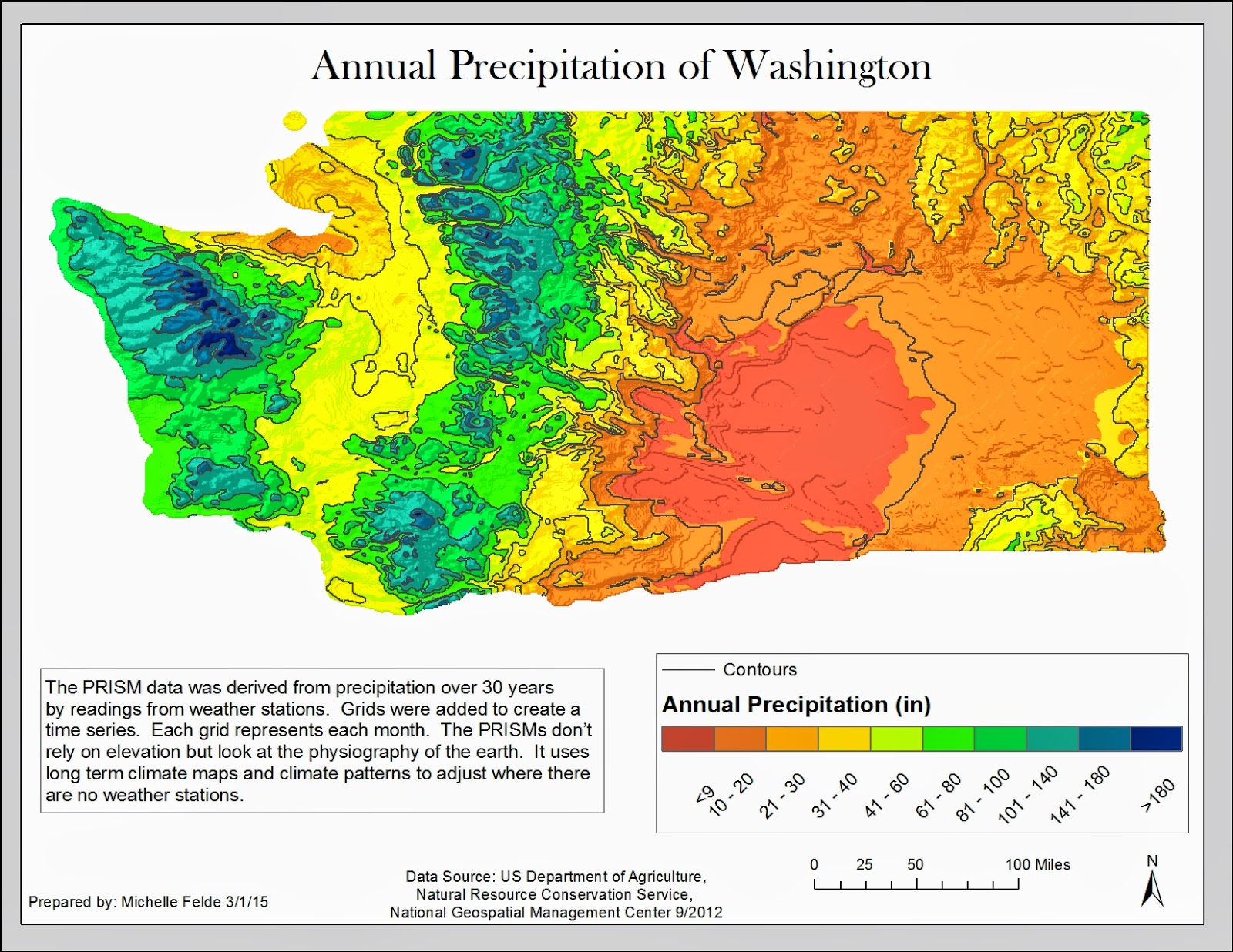
For module 8, we worked with continuous raster data.  With the data, it was also important to understand PRISM Interpolation Method.  With Isarithmic mapping, learning how to display continuous data is important.  We also learned another option for displaying the data through hyposemtric symbology and the legend that goes with it.  Within the maps, to help the viewer, we learned about adding contour lines.

The first map I prepared showed the data with continuous symbology.  This is done under the symbology tab of the layer's properties.  The symbology stayed as "stretched".  I added hillshade effect and adjusted the minimum and maximum.  I added a legend with the graphic being horizontal and used the legend properties to expand the length of the graphic.

The second map I prepared shows the data with hyposemtric symbology.  I first used the Int Spatial Analyst Tool to convert the raster values to integers for the contour lines.  I followed the same steps as the first map but used classes to symbolize the data.  I had the data broken up into 10 classes.  Next added contour lines using the Contour List tool. 

The maps show the annual precipitation of the state of Washington for 30 years.  The contour lines help make the changes in precipitation easier to see and help with analysis.
Map 1

Map 2

GIS 4303: Week 7/8

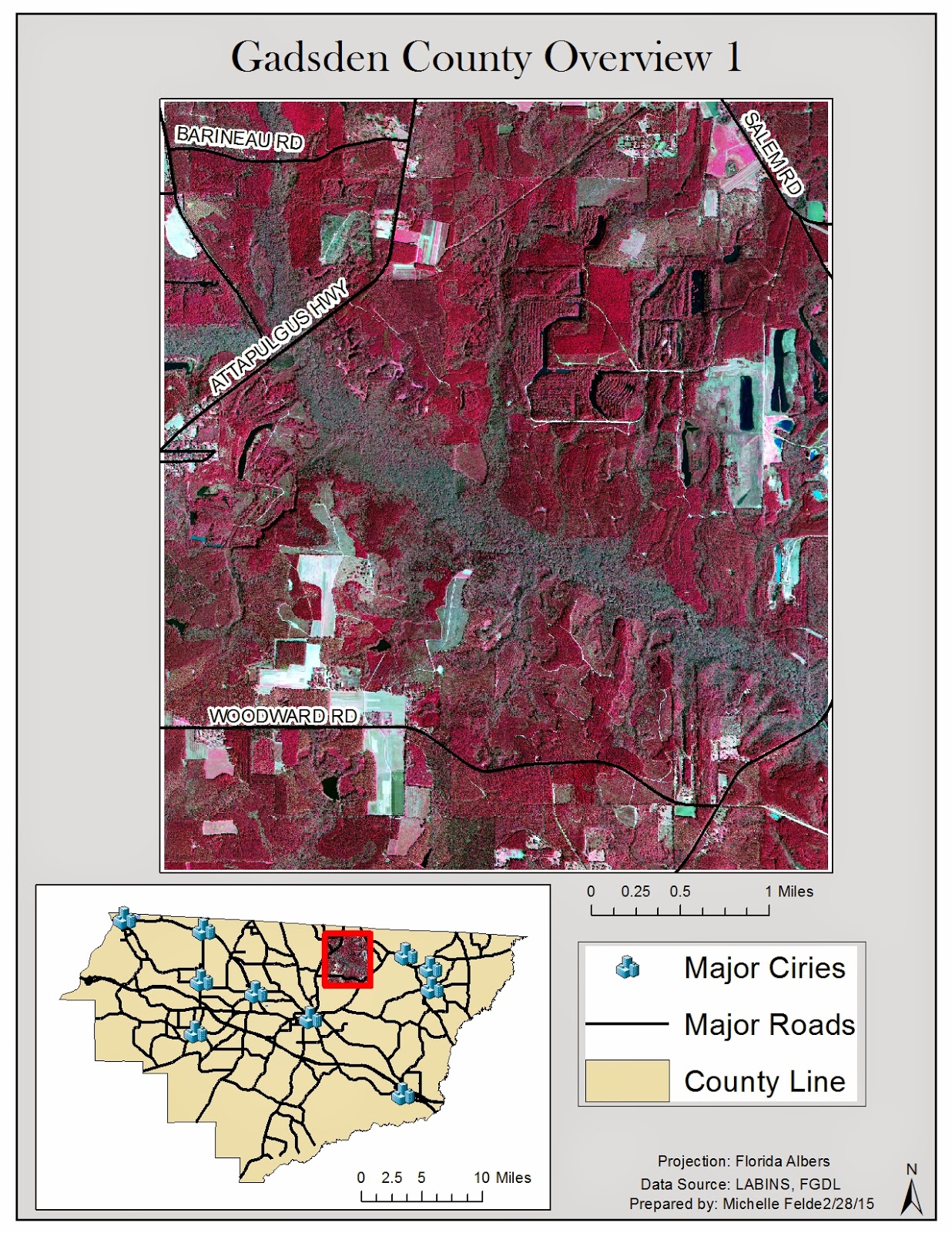
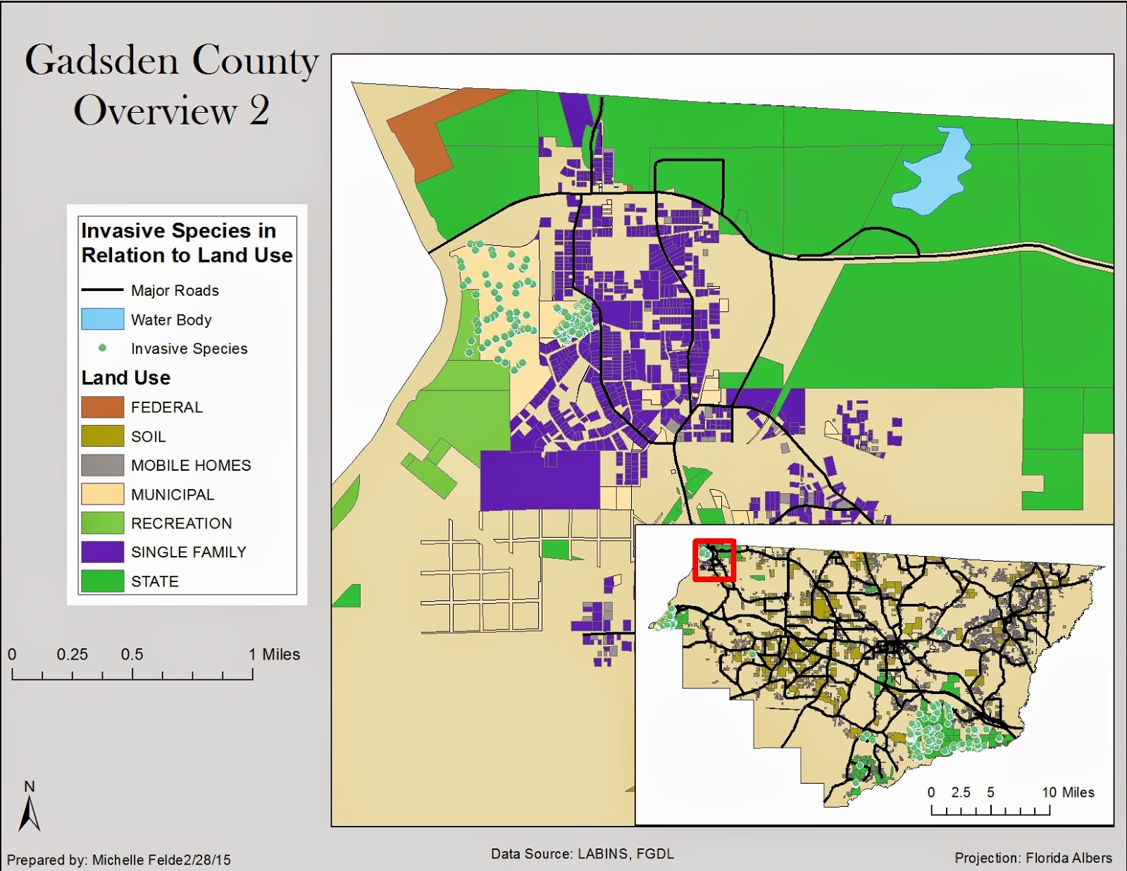
Week 7/8 focused on retrieving data and displaying multiple layers.  Another key component to this lab was making sure all the data is in the same projection.

My maps cover Gadsden County.  This first map shows a digital orthophoto quarter quad of part of Gadsden County.  The inset map shows which part of the county it is and also helps show where the cities are in relation to the DOQQ.  I also labeled the roads to give a better understanding of the location.


The second map shows the relationship between invasive species and land use.  I decided to show a small area of Gadsden County to show the relationship the best.  It is clear to see that the invasive species are around municipal land and parks.  I added the hydrology layer to see if that also affected the location of invasive species.  I added an inset map to help the viewer see where in Gadsden County I zoomed to.


The third map shows land cover and digital elevation model.  I also showed where the cities were in relation to both DEM and land cover.  It could be safe to guess that land cover and elevation might affect city locations.

Thursday, February 26, 2015

Module 7: Choropleth and Proportional Symbol Mapping

This week's lab was to teach us how to select an appropriate color scheme for a choropleth map and the best legend layout to go with it.  The other part of the lab goal to learn how to use proportional or graduated symbols.

To create the map showing Europe's population density by country, adjusted the symbology to show quantities of population density.  The same was done for male and female population, but was normalized by population.  The other purpose of the map was to show wine consumption by country.  This step required using gradual symbols.  I decided to use gradual symbols because it was easier to differentiate from each class. 

This lab caused me to really worry about possibly lying about the data unintentionally.  I am eager to practice more data classification and symbology choices to see which will display a true and good map.

Thursday, February 19, 2015

Module 6: Data Classification

Module 6 went through the different data classifications and compare and contrast the different classifications.  It also helped give experience on how best to symbolize or choose color schemes.

The map for this module displays four different data classification of the population of Escambia over the age of 65.  To display all of the types of data classification, three more data frames were added.  For each data frame I selected to show the data by quantities and changed how they were classified.  I selected natural breaks, standard deviation, equal interval, and quantiles for each data frame.  

I tried to pick a color scheme that would show the low classes and allow me to compare the data across the four maps.  I enjoyed how this lab allows you to see how data is classified can change what the data shows.  One map makes it seem like there is a high population of those 65 and older in one census tract, while another shows there is less.  Data classification can be used to show what you want to show and you hope people only try to show the true data.

GIS 4303 Week 6

This week's lab was the second half of working with projections and adding X, Y data to our map.

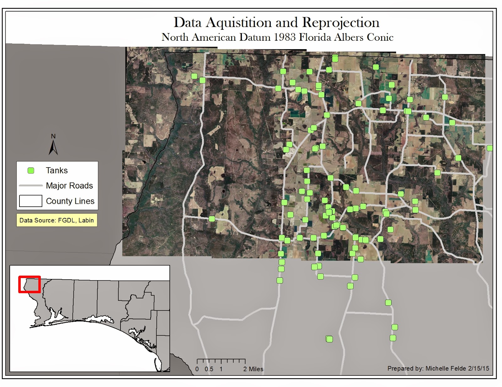
This map is of aerial photos of Escambia County of Florida.  The additional shapefiles of streets and counties need to have the projection changed to Florida Albers.  By doing this through the Project tool, the streets and aerial photos match up.

The next piece I have used at work and is very beneficial is adding points from X, Y data.  By adding this data and exporting it as a shapefile it places the storange tanks on to the map.  In order for the tanks to be in the right location, I had to reproject to WGS84.

I think this lab was good practice for what we will come across in the real world.  Data will be in different projections, but need to redefine it.  It shows how important it is to know details about your data so you can map accurately.

Thursday, February 12, 2015

Module 5: Spatial Statistics

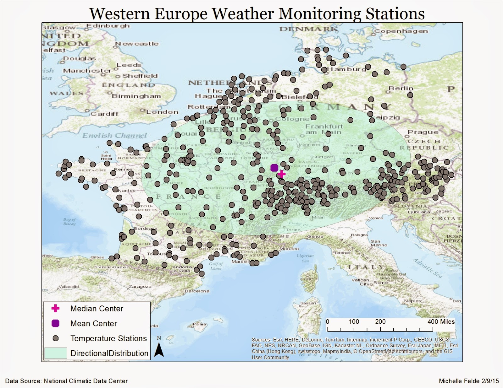
Module 5 was about understanding spatial statistics and learning how to apply the tools in ArcMap.  The tools helped find mean and median distribution of data.  Also able to display the data through a histogram, QQ plot, and learn to find outliers with spatial statistic tools.

One of the exercises used the mean center tool to show the mean location of the data  with a symbol.  I then used the median center tool to display the median location of the data.  This shows the clusters in certain countries have a greater affect on the median. To see the direction of the distribution used the spatial analysis toolbox.  As you can see on the map, it is an east-west orientation.  The large ellipsoid shows there is a large variation between the locations of the data.

It is important to understand how to use the data and what it is saying.  Understanding statistics will help aid in the analysis of data.

Sunday, February 8, 2015

GIS 4303 Week 5

Week 5 covered projection, how to reproject and how to adjust coordinate systems for different layers.  Also learned how to map multiple data frames.

This map is showing three different projections: UTM, Albers, and State Planar.  To create this map, three separate data frames were required.  I started with one shapefile of Florida and used the Project tool to change the projection into two other coordinate systems creating new layers.  Looking at the map of all three, it is clear to see how Florida changes under the projections.  The area of the four specific counties have changed from projection to projection.  The changes in area can also be seen in the legends.
This lab is one of the most important to understand.  Projection is key to creating an accurate map.  If the projection is off, locations won't be portrayed correctly.  Different data will be in various projections which is why it is important to learn how to change the coordinate system to a usable one.

Thursday, February 5, 2015

Module 4: Typology

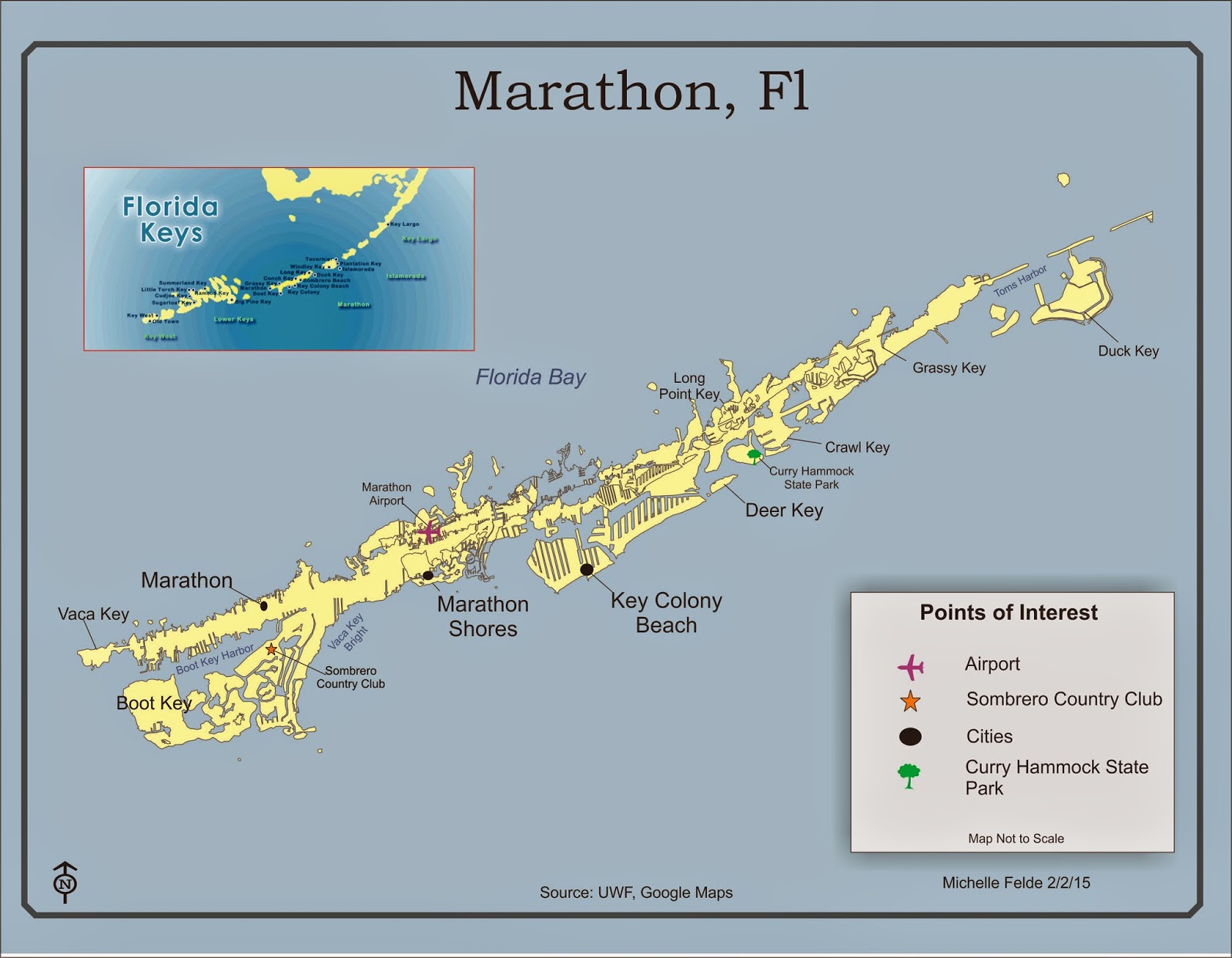
Week 4's map was to teach us about typology and show an understanding proper placement of map elements.

This map is of the Marathon, Florida of the Florida Keys.  The major cities were labeled, along with a state park and airport.  Another key element to label was each key along with the bodies of waters.  All of the edits to the map were created in CorelDraw.  The main tools used were import, text tool, curve tool, and adjusting properties.  I had to use lines to label the cities and keys since the labels were too large to place on the land. 

I had to think carefully of font size and position to make sure the map didn't become too crowded or hard to read.  The different font sizes help the viewer determine which labels are the most important.  I also kept the font san serif to help make it be more readable. 

I think this lab was rather challenging to create a map that was easy to read and display all the elements.  I feel if I was able to create a good map in this lab, I should be able to tackle most.

Wednesday, February 4, 2015

GIS 4303 Week 4

Week 4 lab was about sharing maps on ArcGIS online and map packaging.  The first part of the lab was learning about map packaging and the different types of packaging.  I adjusted the data in ArcGIS and logged into ArcGIS online through ArcMap.  To have the map contents in my content, select Share As.  From this pop up box the item description, tags, credits, and summary.  I analyzed the share to make sure there were no errors and then selected Share. See Image 1 below.

The second part of the lab consisted of optimizing map package.  After adding the data, one layer would be a generalized layer while the other detailed.  In both layers I adjusted the symbology and set the scale from ArcGIS online to show the detailed trees if zoomed in at a large scale.  On the generalized layer, I adjusted the properties so the trees would be smaller when zoomed out, but invisible when zoomed at the large scale.  I then followed the steps from the previous section of selecting Share As and added the item description, tags, credits, and uploaded the text file for additional details.  See image 2 below.

Learning to share map packages seems for powerful and something to possibly use at my work.  It would allow for people to see the map created and work with it.  It also amazes me how much data you can share and use from others due to this tool. 


Image 1

Image 2

Wednesday, January 28, 2015

Module 3: Cartographic Design Principles

Week 3 lab's focus was applying cartographic design principles.  We were to make a map based on the need of the of the user as well and apply the design principles such as visual hierarchy, contrast, and balance.  Learning to create an inset map was also one of the objectives.

The map created was to show the three different types of schools in Washington D.C. that are in Ward 7.  One of the key steps was to clip Ward 7 shapefile with the school shapefile.  This allows us to have a shapefile of just the schools in the 7th ward and allows us to adjust the symbology for just those schools.  Besides adjusting the symbology for the schools, also adjusted the symbology for the roads to clean up the map.  The various neighborhoods were then labeled to help make those clear.  Having two data frame layers allows for the designer to use an inset map to help show the location of the main map.

Once all the elements were added and adjusted, the next thing was to create balance within the map.  I tried to keep elements well spaced to keep from one area seeming heavy.  I also added a background color to the inset map so that would stand out more and not leave too much white on the map.  By adding color, it created a contrast which helps the user reference the map to see where exactly the 7th ward is in regards to Washington D.C.

This lab forced me to really thing about what goes into good map design.  It is easy to see how certain principles can be overlooked but it is amazing how implementing the design principles changes the map.  Hopefully as course goes on, I continue to master incorporating these principles.

Tuesday, January 27, 2015

GIS 4303 Week 3

This week in Introduction to GIS we learned about adjusting symbology, difference between raster and vector data, and cartographic design.  The lab taught us how to design a map to display the message we want to communicate.

One of the maps created was to display the various roads, railroads, and rivers in Mexico with the urban areas.  The symbology was adjusted to show a clear and less cluttered map.  On this map, it was also more beneficial to label the cities of Mexico so the viewer could identify the urban area. Labeling the map also helps the viewer see which cities are in the center of Mexico.  Adding a new data layer to create an inset map was very helpful for the viewer to see the large map is the center of Mexico.

This lab really showed the importance of labels and symbology.  It was interesting to see how much a map changes and can be impacted by these properties.  Maps can easily show misguided information if you select poor choices in color or symbology.

I was happy to learn more tools to improve my maps while working on the last three processes of map design.

Thursday, January 22, 2015

Module 2: Graphic Design

Week 2 assignment objective was to take a map out of ArcMap and improve the graphics and add elements in CorelDraw.  By adjusting/adding certain elements I was able to show what I have learned about CorelDraw.  The final piece was to export the CorelDraw file as a .jpg. 

The map I created was for a children's encyclopedia on the state of Florida.  The base of the map (the shapefiles of the counties, cities, water, and capitol) were first created in ArcMap.  I exported the map to CorelDraw. I used the Edit- Find and Replace - Replace Objects tool to change the color of the cities to a purplish color.  I also added a star shap to represent the capitol of Florida by using the Polygon tool. 

Since there isn't a shape for the north arrow, I created one my using the line tool and added the arrow pieces to the line.  The line/arrow tool was also used when marking the cities and text box to label them. 
The next part was adding text boxes to put in the title and map information.  I also chose to add the state nickname, animal, and flag.  Too add some flare, I added a drop shadow to the two photos. 

I found CorelDraw to be rather difficult to work in and design the map.  I am hoping to learn to semi-master CorelDraw so I can use it to enhance my maps when appropriate.


Source: UWF, pixshark,com, netstate.com, & State
Symbols USA

Tuesday, January 20, 2015

GIS 4043 Week 2 Lab

Module 2: Own Your Map

This module was about creating a professional looking map and using the tools of ArcMap to do it.

The map created this module contained an inset map.  The process to create an inset map taught me a lot of the capabilities of ArcMap and was excited to learn how to create it.  I wasn't aware of being able to have multiple data frames in one map. 

I really enjoyed walking through steps of editing layers and shapefiles to just show the information/data you only want the audience to see.  As I was going through the steps I was wondering how I might be able to apply these tricks to maps I have worked on in the past.

Once all the data was added to the table contents and map elements such as legend, title, north arrow, and scale, it was good exposure to play around with all the settings.  To re-size the data frames, legend, and north arrow.  It was interesting to see how adjusting items such as font can really change the look of a map as well.  I can also see how it is easy to get carried away and let all the tools/setting cause your map to lose focus of what is truly is about. 

Besides how a map looks being important, it is also important to know what data you are working with.  Seeing the metadata in ArcCatalog and how to see which coordinate system the data is in, seems to be one the key elements to creating a good map.

Tuesday, January 13, 2015

Module 1: Map Design

Designing a good map can be a difficult challenge.  There are certain elements to keep in mind when creating a map.  Three guides that can be used are Tufteisms, mapping Commandments, and the Five Principles of Cartographic Design.  Below are examples of good and bad map design.

Good Map Design


Source: South Carolina Department of Natural Resources
http://dnr.sc.gov/wma April 2009
This map is an example of good map design.  One design element this map follows is the 5th Commandment, Map Layout Matters.  The creator of this map used their space wisely and used the open space around the state for legends, north arrow, and data source. 

The map also shows the 3rd Principle and 4th Commandment.  This is done by keeping the map clean and only putting details the audience will need in order to understand what counties are in which game zone.  The zones are clearly defined so there is no confusion where one ends and another begins. 

The third element of good map design is the map is clearly labeled.  It is easy to read all the numbers for the game zones and the counties.  The creator did not clutter the map with other labels, such as cities or roads.  The map seems to be telling the data and truthfully. 
 
Bad Map Design
 

This map is an example of bad map design.  The obvious issue with this map is it is cluttered and hard to read.   This violates Tufteism 7 and Commandment 4.  There are labels over each other and symbols over lapping labels which leads into principle 2.  There isn’t a clear hierarchy to the map either.  It is hard to tell what the most important piece on the map. 
Source: UWF
The creator of this map did maximize information, but at a huge cost (Principle 5).  The map is telling a lot but not clearly and very chaotic.  I think the creator of this map should have reviewed the map and made some edits to help their audience understand their message.  Reviewing and revising is both a Tufteism and a Principle which is key to improving any map.


Sunday, January 11, 2015

GIS 4043 Week 1 Lab

This week in Introduction to GIS was the start to learning about ArcGIS desktop.  The lab taught the basic components of using ArcGIS and more specifically ArcMap. 

We first learned how to import shapefiles from our data.  The two shapefiles were the "Cities" and "World Countries".  The countries shapefile contained data on the population from 2007 which we could see from the attribute table.  The lab helped us locate certain countries by doing a Find.  Once we were done exploring all the tools, we created the map we wanted.

The first thing was adjusting the properties of each layer.  We changed the size and shape of the cities on the map.  We also changed the symbology of the World Countries shapefile. We selected to show the symbol by quantities.  The next step was to select what field that contained the attribute we wanted displayed, population.  Changing the color ramp helped define the population classes, which we adjusted to seven levels. 

The second part of the map was learning the key parts to a map.  The Insert menu contained the items we needed such as Title, Legend, Scale Bar, North Arrow, and Text box.  These elements helped explain the map.  Without these pieces the audience wouldn't know the population classes and what the map is telling.

Overall I felt this lab was very informative and helped me understand ArcMap even more.

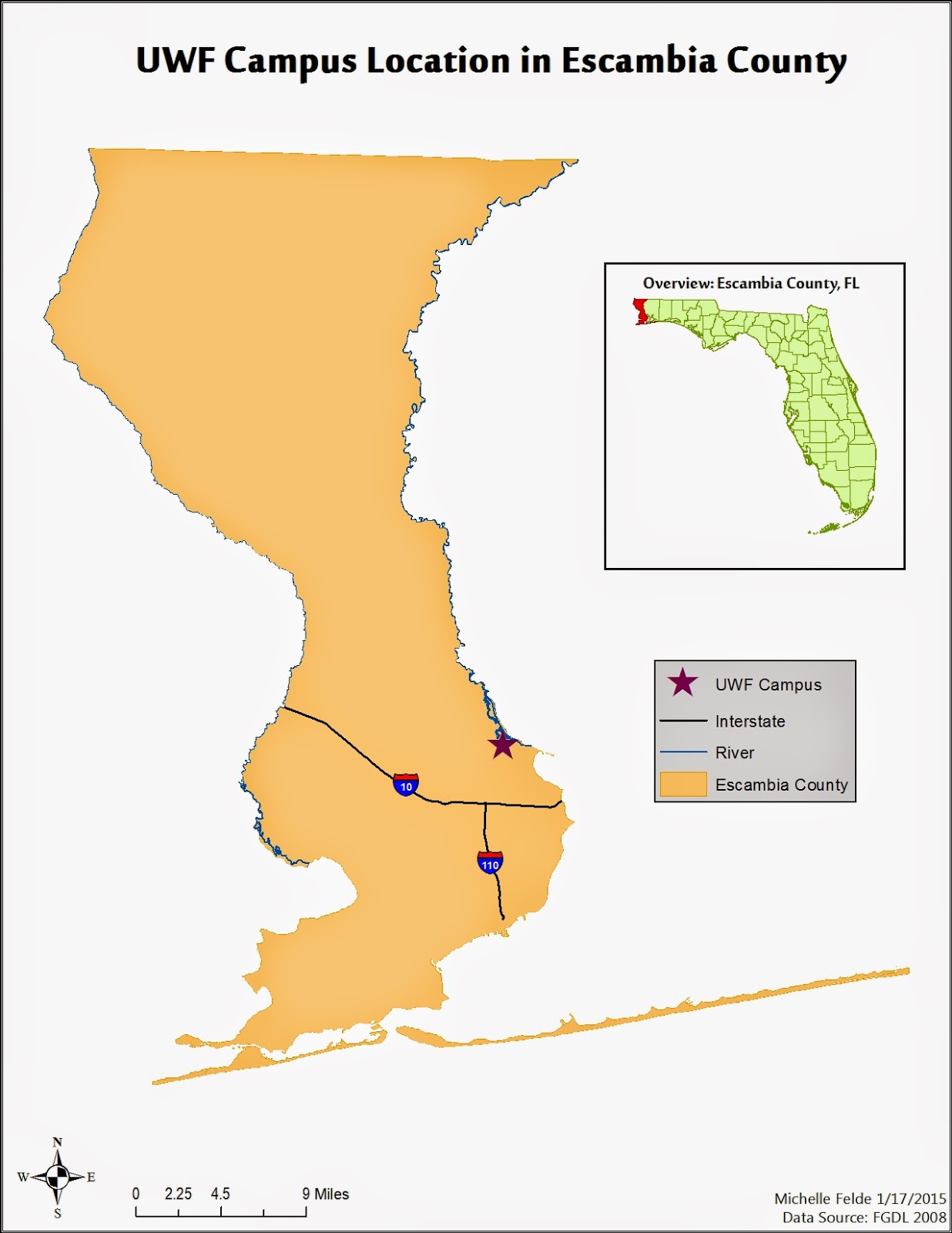
The map I created is shown below.